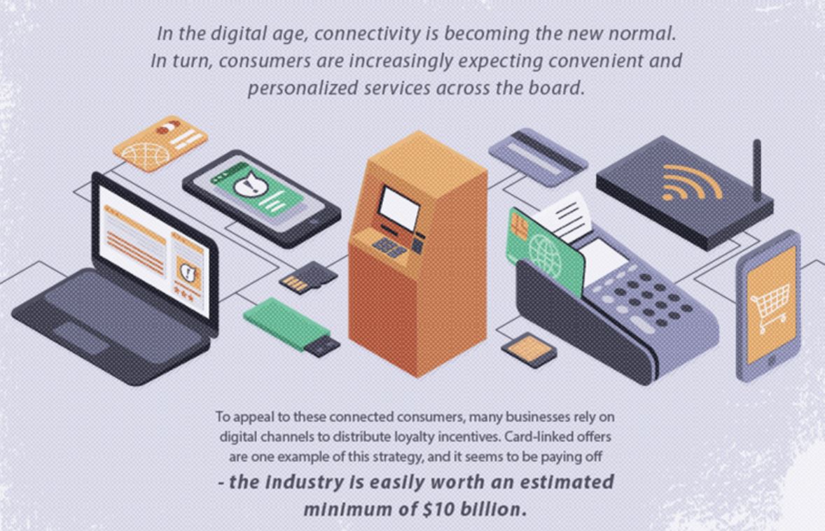
- Our world in data – tutaj zawsze można znaleźć jakiś ciekawy rysunek (np. 12 key metrics to understand the state of the world)
- Gapminder (a tam np. Dollar street, Tools)
- Human progress (Life in numbers)
- Visual Capitalist
- Tableau Public
- Data Is Beautiful
- Overflow Data
- World Data Lab aims to deliver insights to everyone (warto zajrzeć na ich bloga)
- Pew Research Center
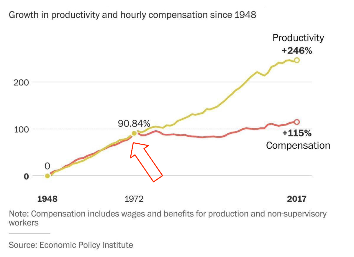
- WTF 1971 (Dangerous Economic Dogma)
The Most Powerful European Economies
European Economies by GDP (1960-2100)
Największe gospodarki w Europie według nominalnego PKB
Top 20 European Economies by GDP Per Capita (1960-2020)
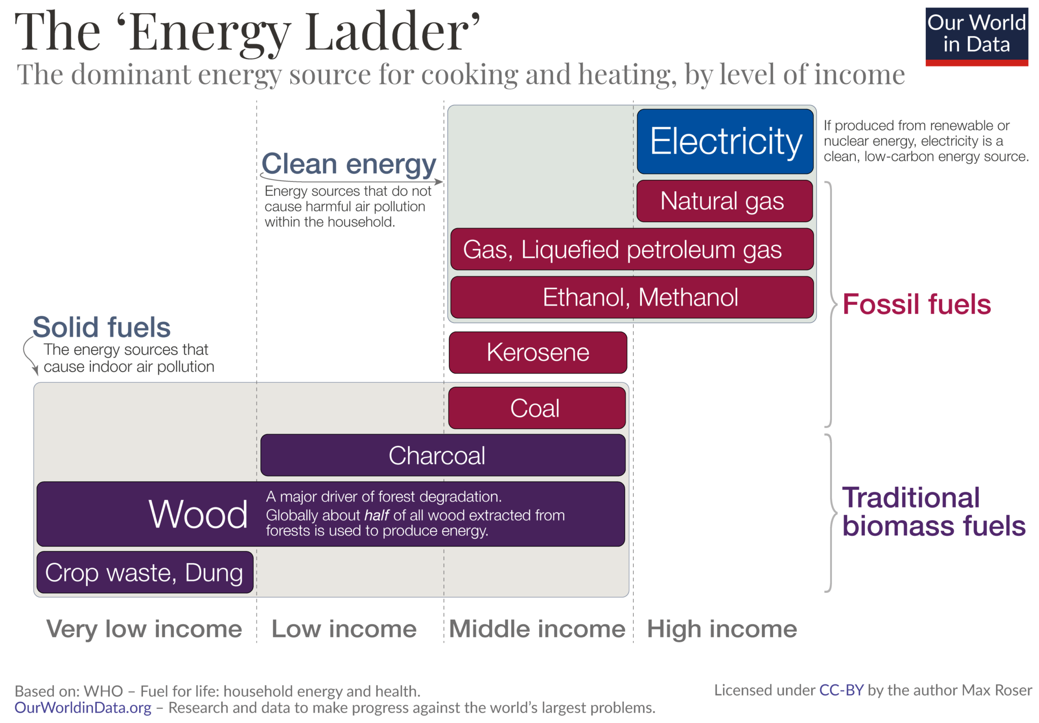
The ‘Energy Ladder’: What energy sources do people on different incomes rely on?
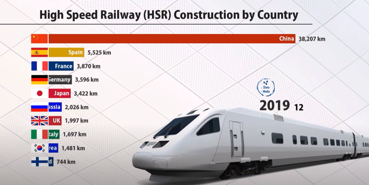
High-Speed Railway (HSR) Construction by Country (1965-2019)
High Speed Railway Construction by Countries (1965-2021)
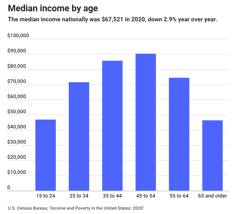
U.S. household income by age, gender, education and more
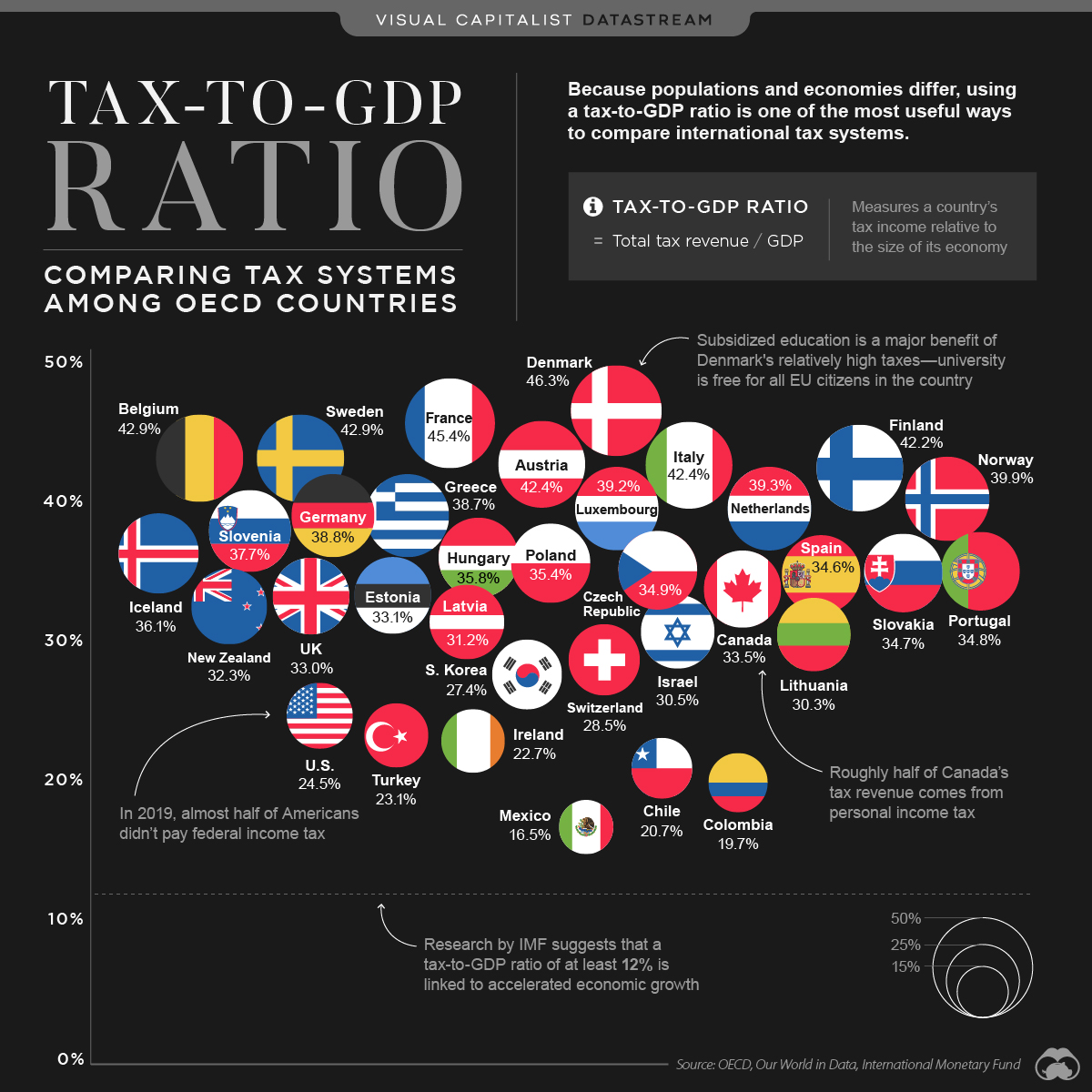
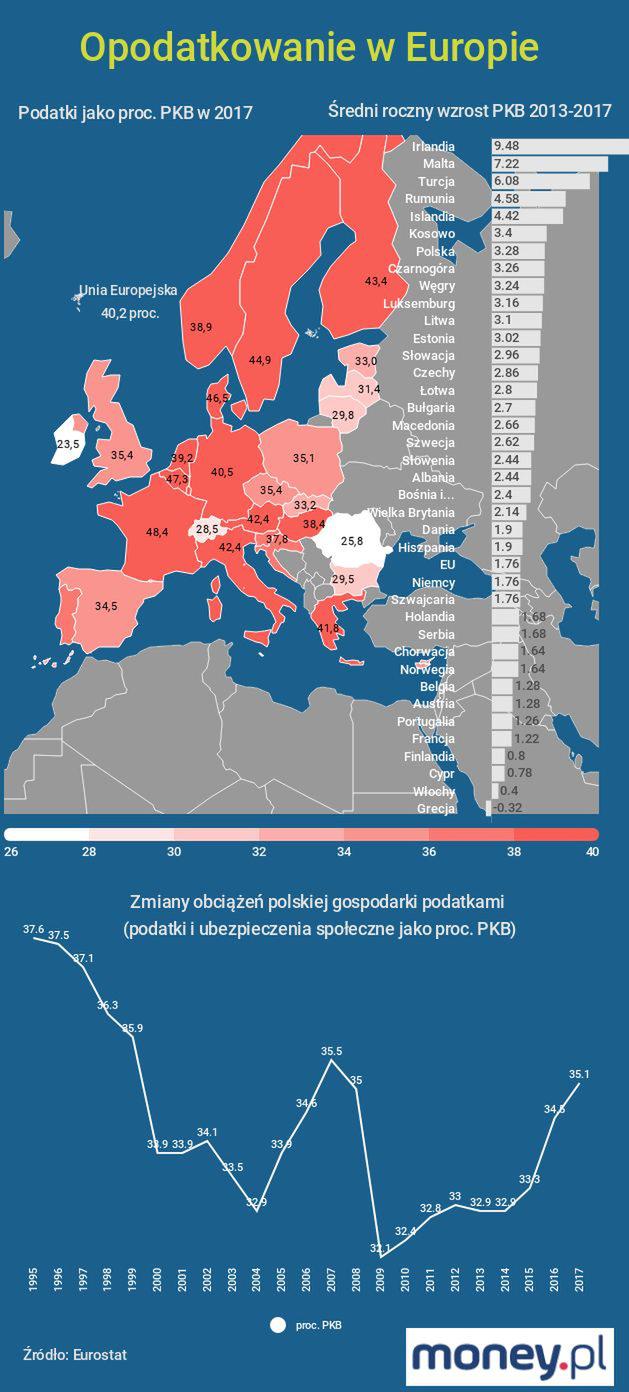
Tax-to-GDP Ratio: Comparing Tax Systems Around the World

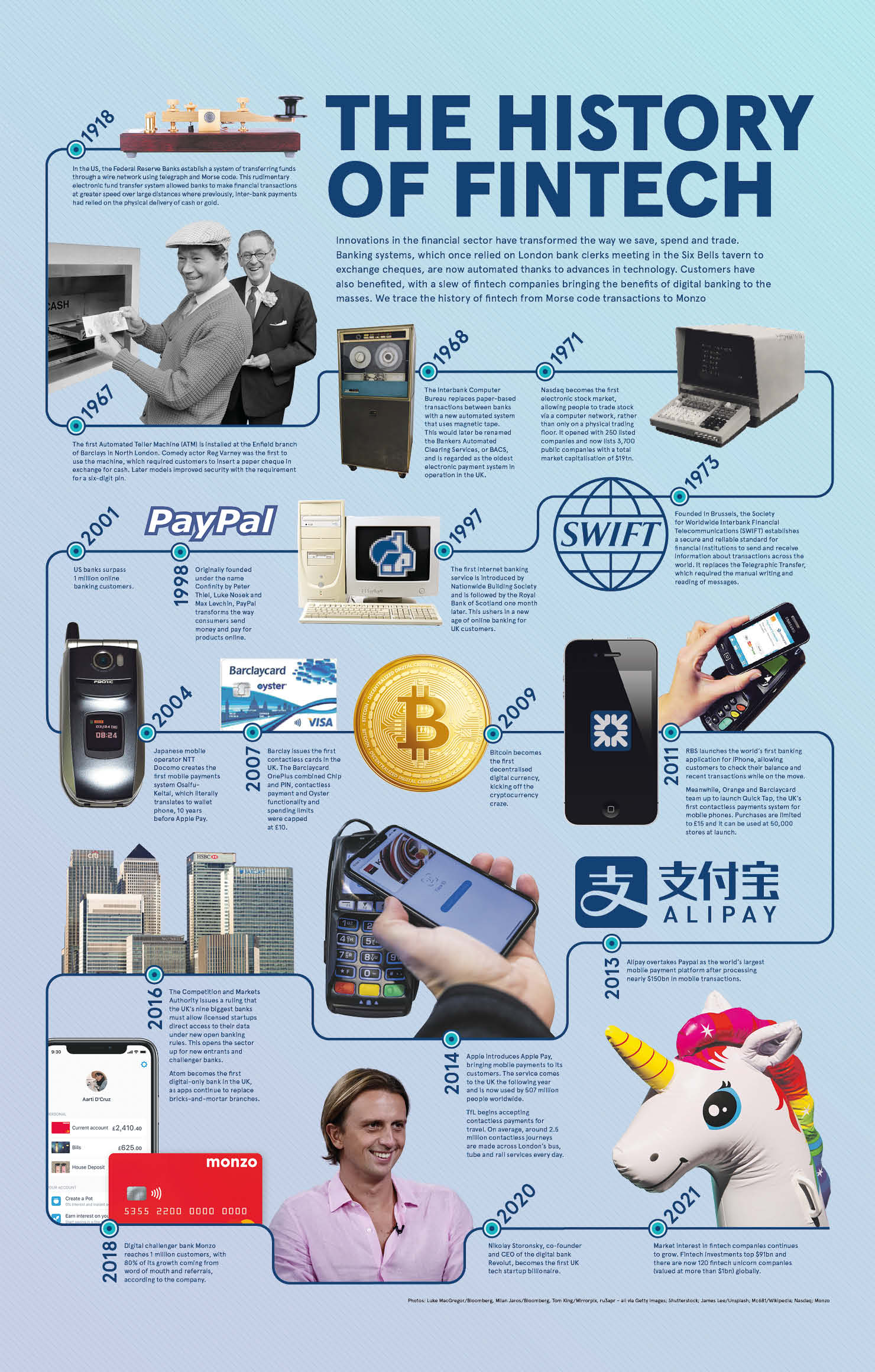
The history of FinTech 1918-2021
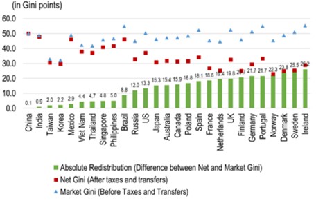
Cronyism, Not Welfare, Is China’s Big Problem(Gini index)
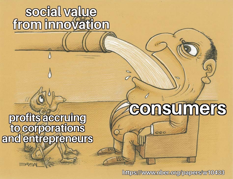
Illustration to Schumpeterian Profits in the American Economy: Theory and Measurement
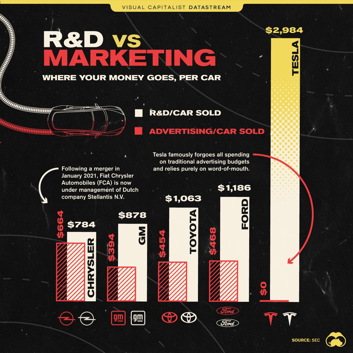
Comparing Tesla’s Spending on R&D and Marketing Per Car to Other Automakers
W socjalizmie jedyną trwałą rzeczą są ‘przejściowe trudności’.


33 lata temu PRL-owskie władze wprowadziły kartki na mięso i wędliny


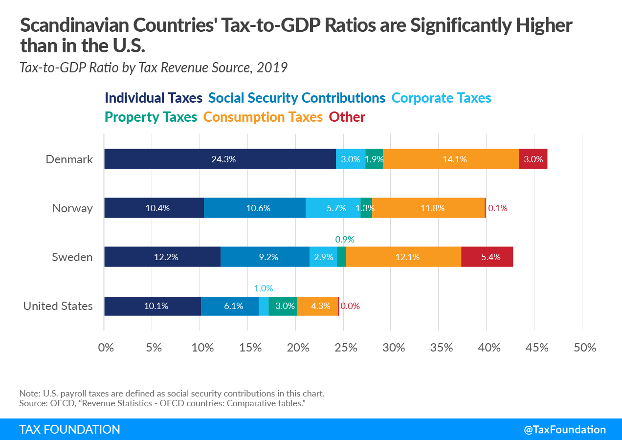
Insights into the Tax Systems of Scandinavian Countries
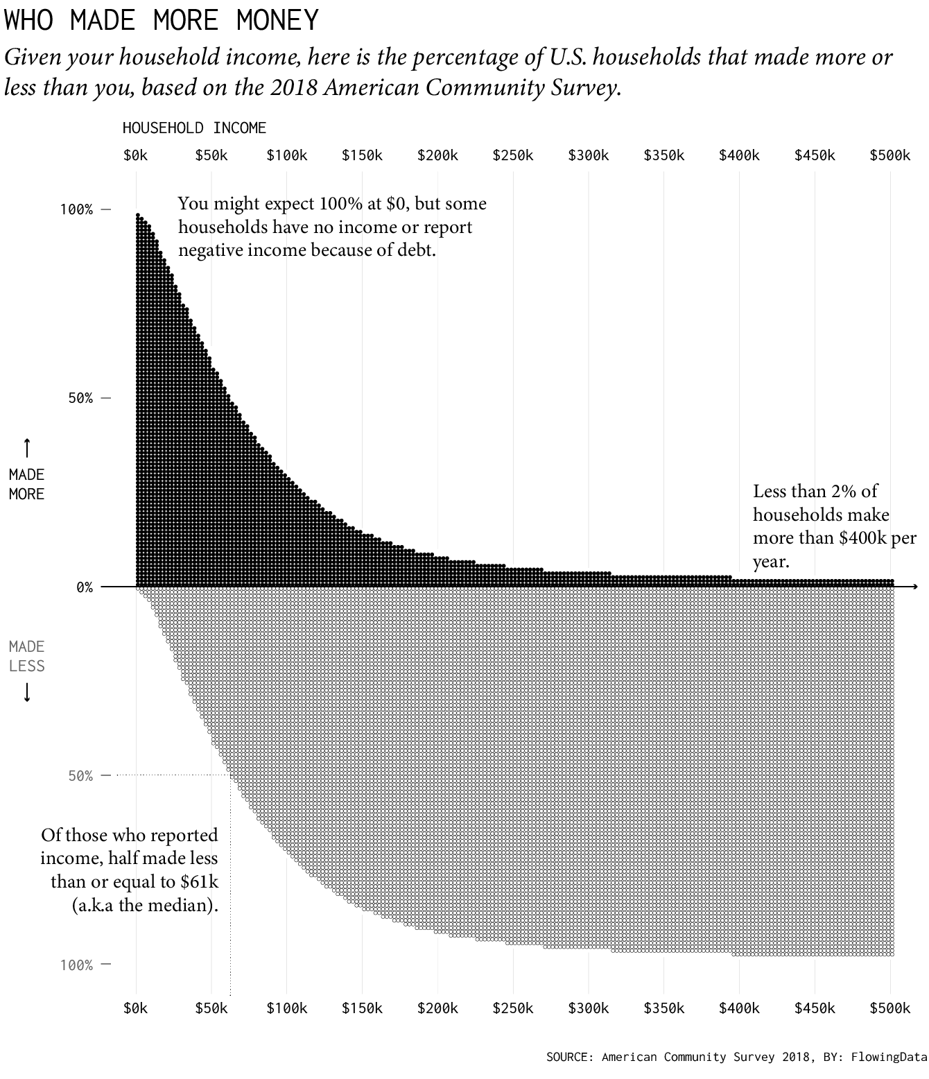
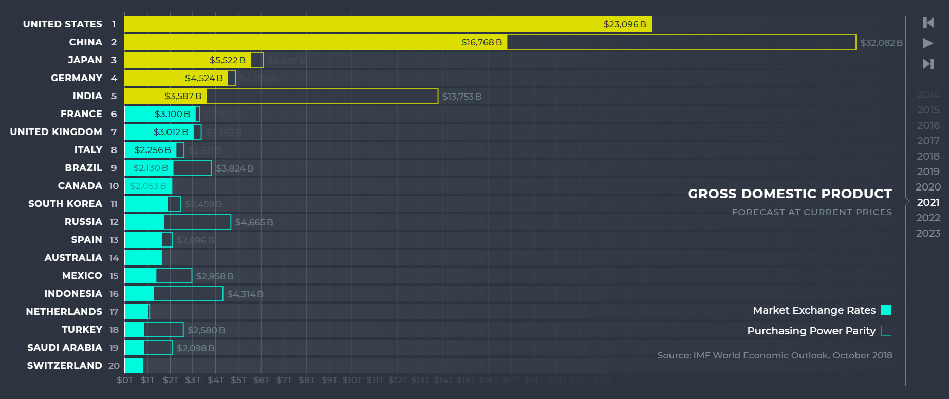
Ranking państw wg PKB (PPP) 1995-2023 – animacja
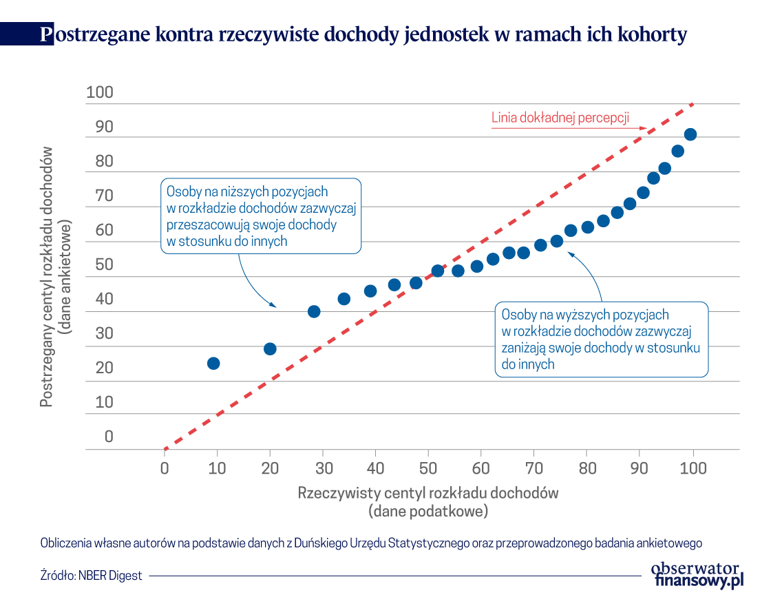
Co wpływa na nasze poglądy na temat nierówności dochodowych?
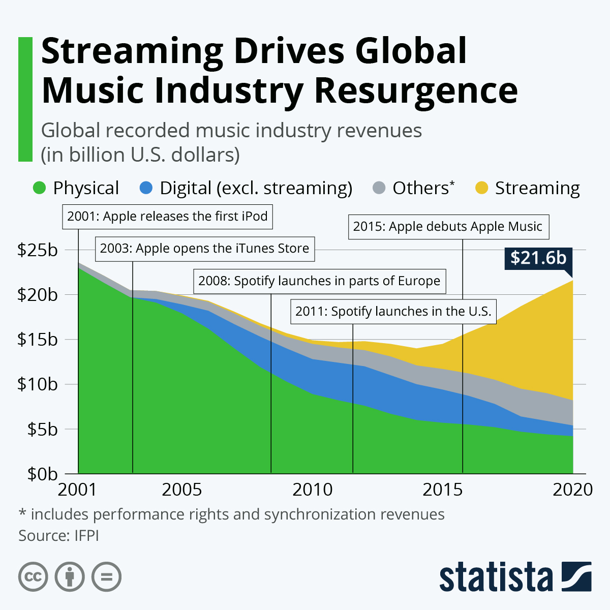
Streaming Drives Global Music Industry Resurgence

Polarny Jedwabny Szlak. Arktyczne ambicje Pekinu


Ranking zarobków w Polsce według miast
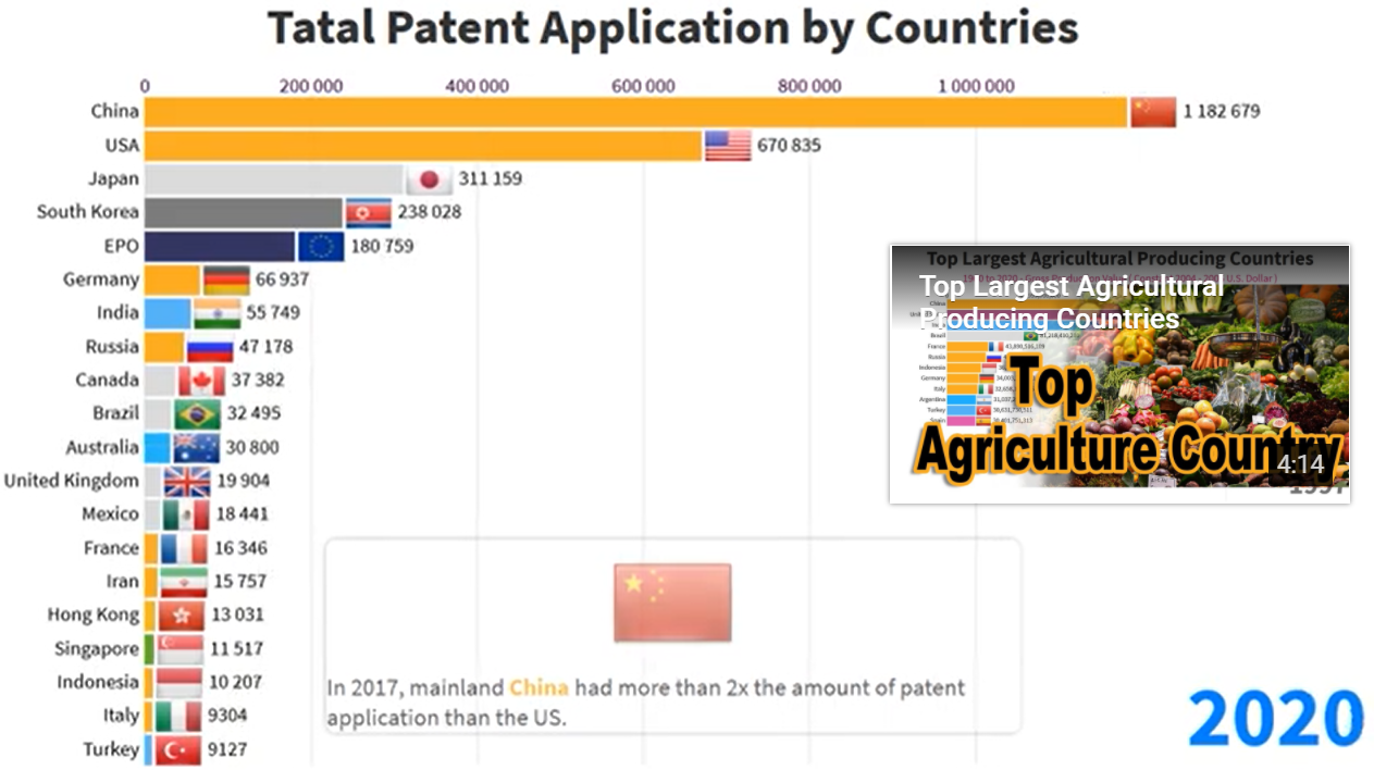
Top Largest Country Total Patent Invention History

Dziesięć przykazań logiki

Zdjęcie to zawsze, kiedy na nie patrzę, powoduje to, że ogarnia mnie wzruszenie. Aleksander Sołżenicyn został uhonorowany nagrodą Nobla z literatury w 1970 roku (za „siłę moralną, zaczerpniętą z tradycji wielkiej literatury rosyjskiej”). Nie mógł jej odebrać, bo obawiał się, że kiedy wyjedzie z Rosji Sowieckiej to nie będzie mógł wrócić, bo nie zostanie wpuszczony do kraju. W 1974 roku został jednak i tak wydalony ze Związku Sowieckiego. Wtedy to dopiero mógł oficjalnie odebrać Nagrodę Nobla, a było to w roku kiedy ‘Nobla z ekonomii’ dostał Friedrich von Hayek. Na zdjęciu tym Hayek (autor ‘Drogi do zniewolenia’: https://pl.wikipedia.org/wiki/Droga_do_zniewolenia) bije brawo Sołzenicynowi (autorowi ‘Archipelagu GULag’: https://pl.wikipedia.org/wiki/Archipelag_GU%C5%81ag) podczas ceremonii w 1974 r., w momencie kiedy Aleksander Sołżenicyn odbiera nagrodę Nobla.


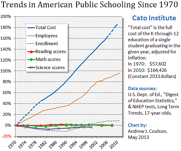
Public School Spending (Education)
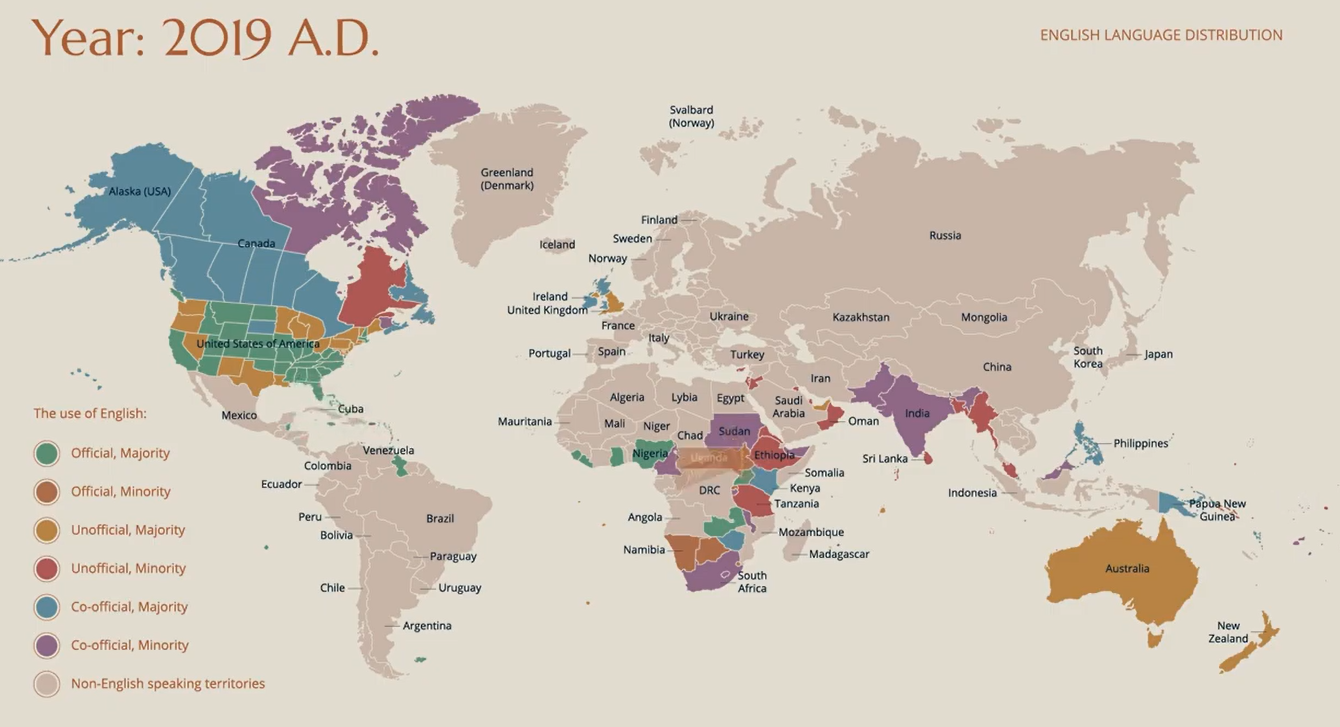
The spread of the English language
What Matters Most to People in Each Country

Myśleć, myśleć.

Test na libertarianizm. Jaki jest poziom Twojego libertarianizmu?
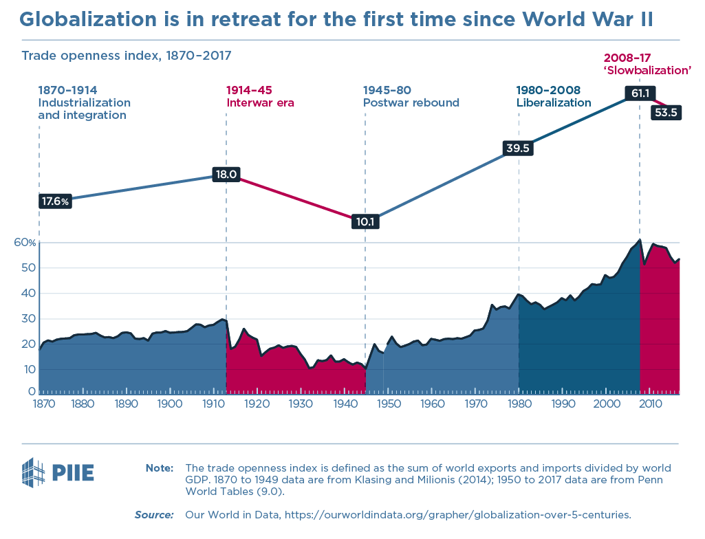
The pandemic adds momentum to the deglobalization trend

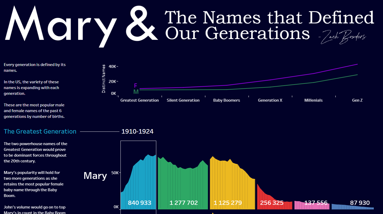
Mary and the Names that Defined Our Generations
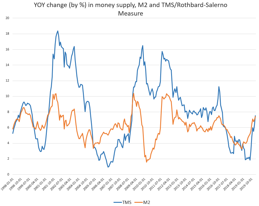
Money Supply Growth Climbs to 37-Month High
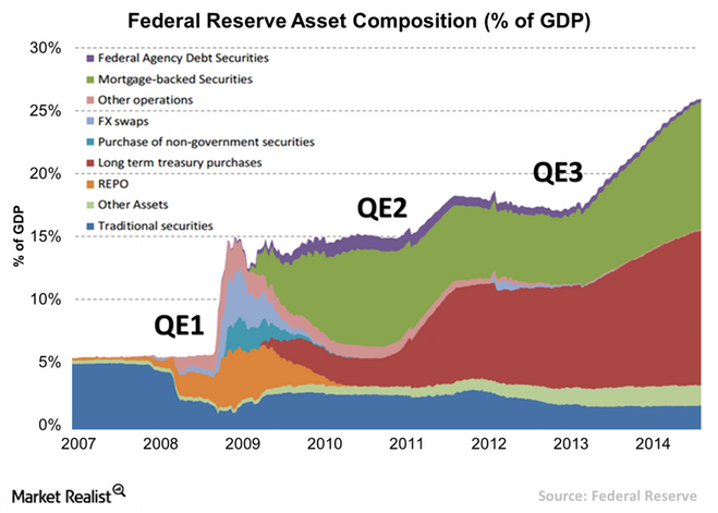
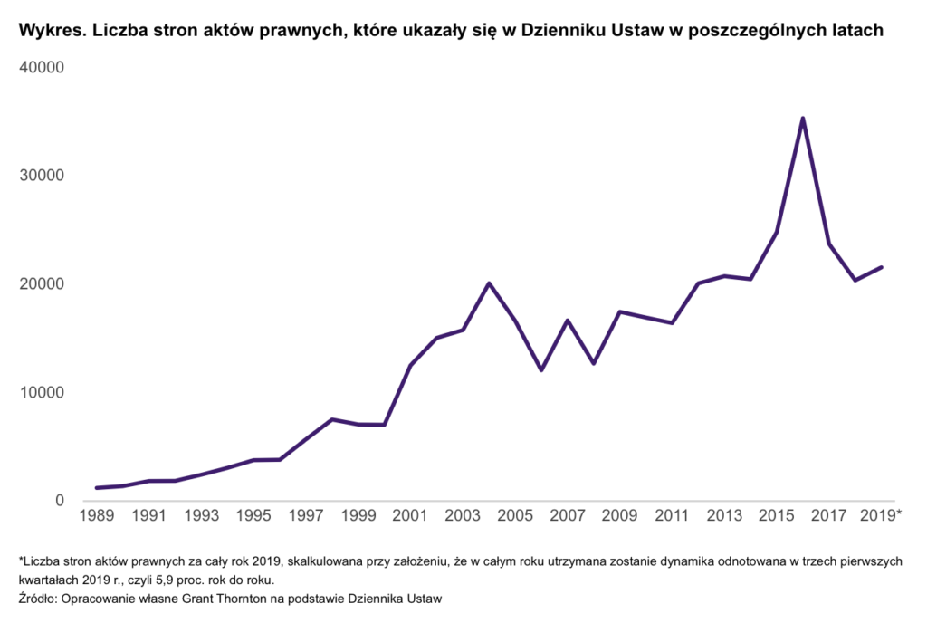
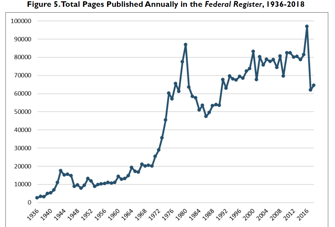
Federal Register
Podobnie jest z objętością prawa Unii Europejskiej
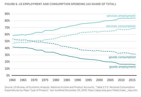
5 Stats That Show American Workers Are More Prosperous Than Ever
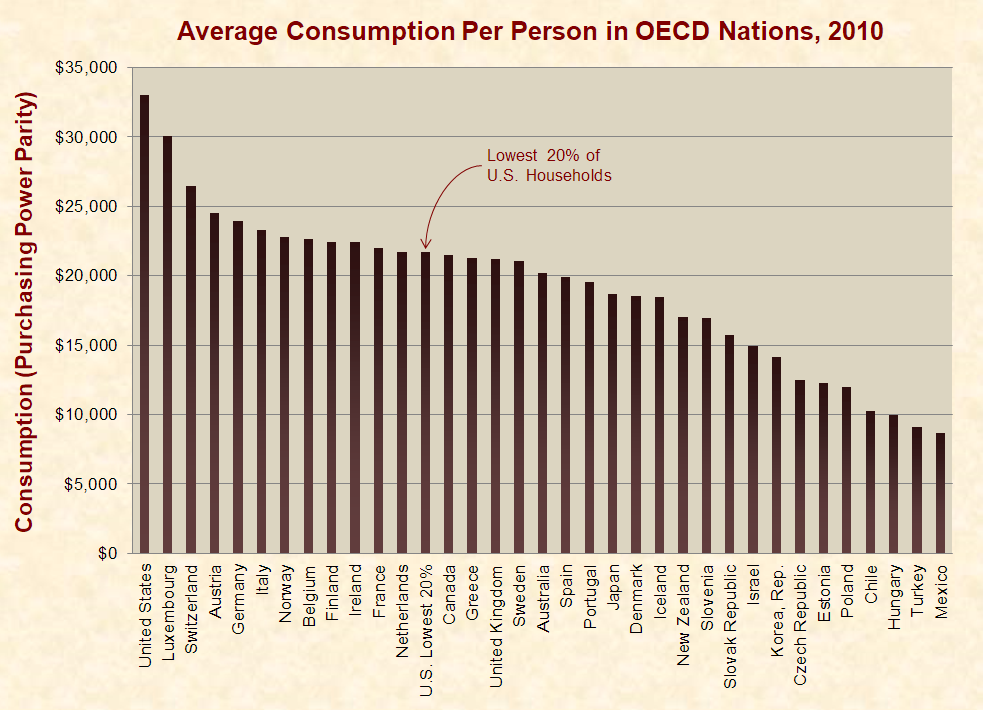
The Poorest 20% of Americans Are Richer on Average Than Most European Nations
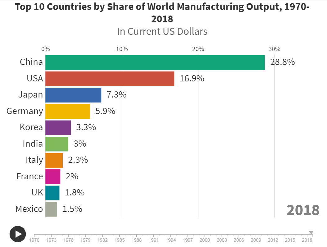
The World’s Top 10 Manufacturing Nations Since 1970
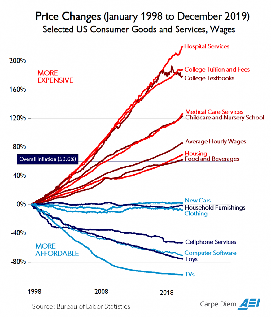
In One Image, Everything You Need to Know about Government Intervention
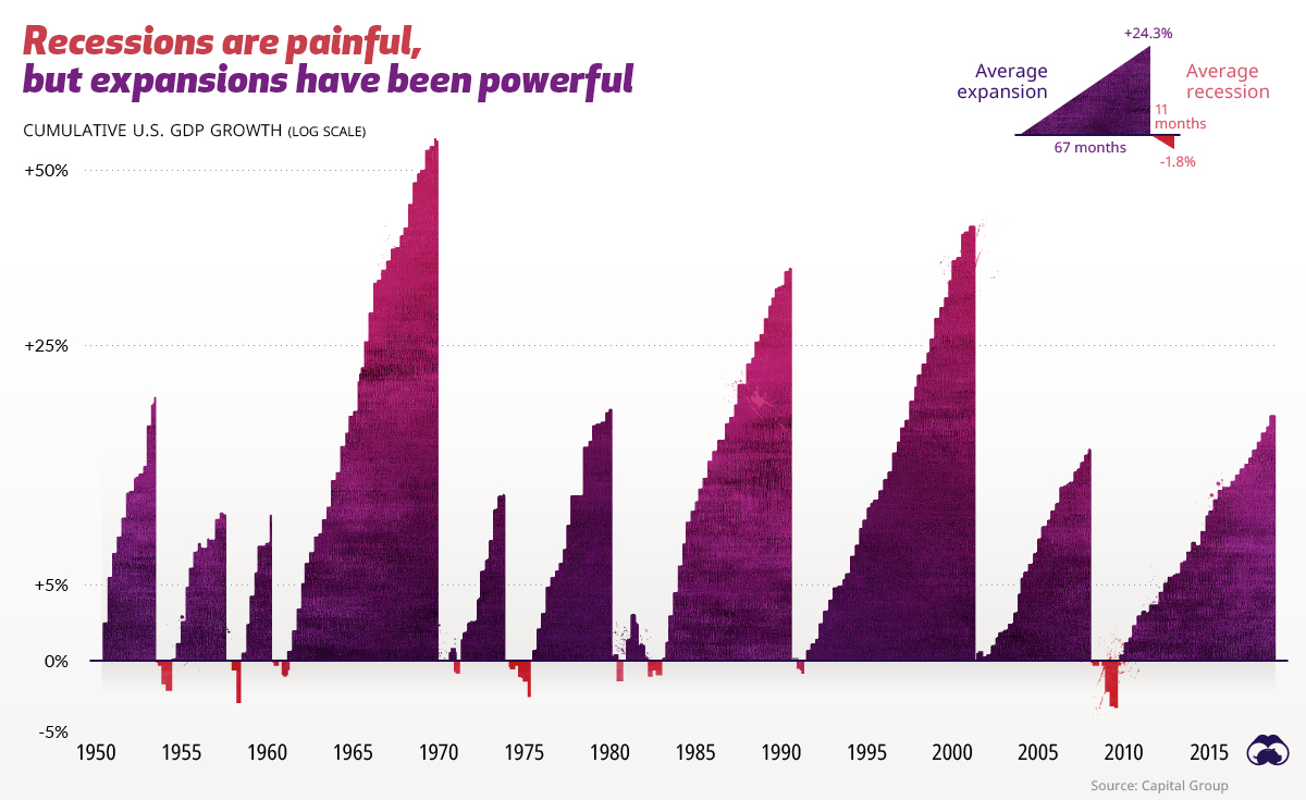
Everything You Need to Know About Recessions

2014-2018 Median Household Income in the United States by County
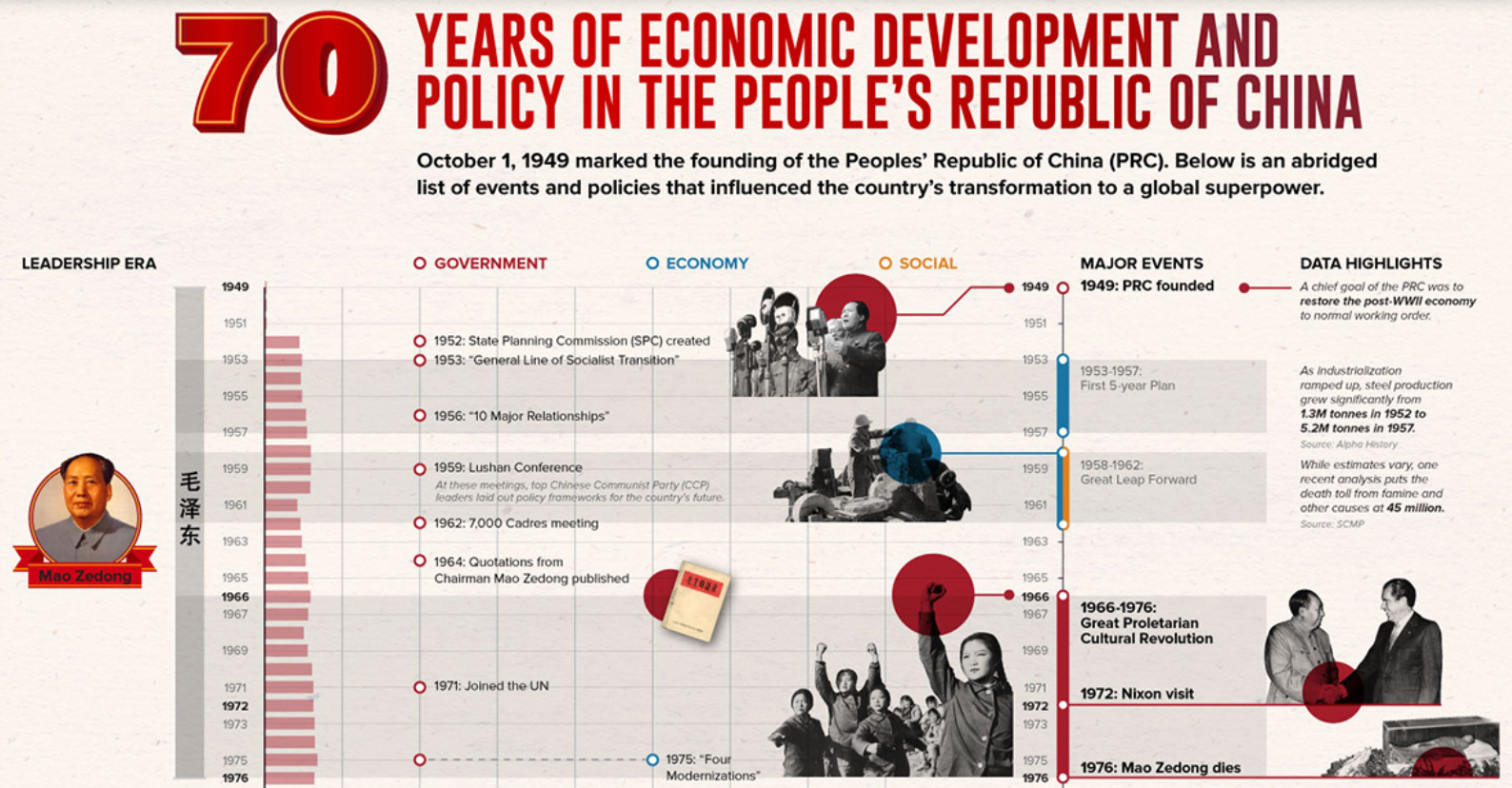
The People’s Republic of China: 70 Years of Economic History
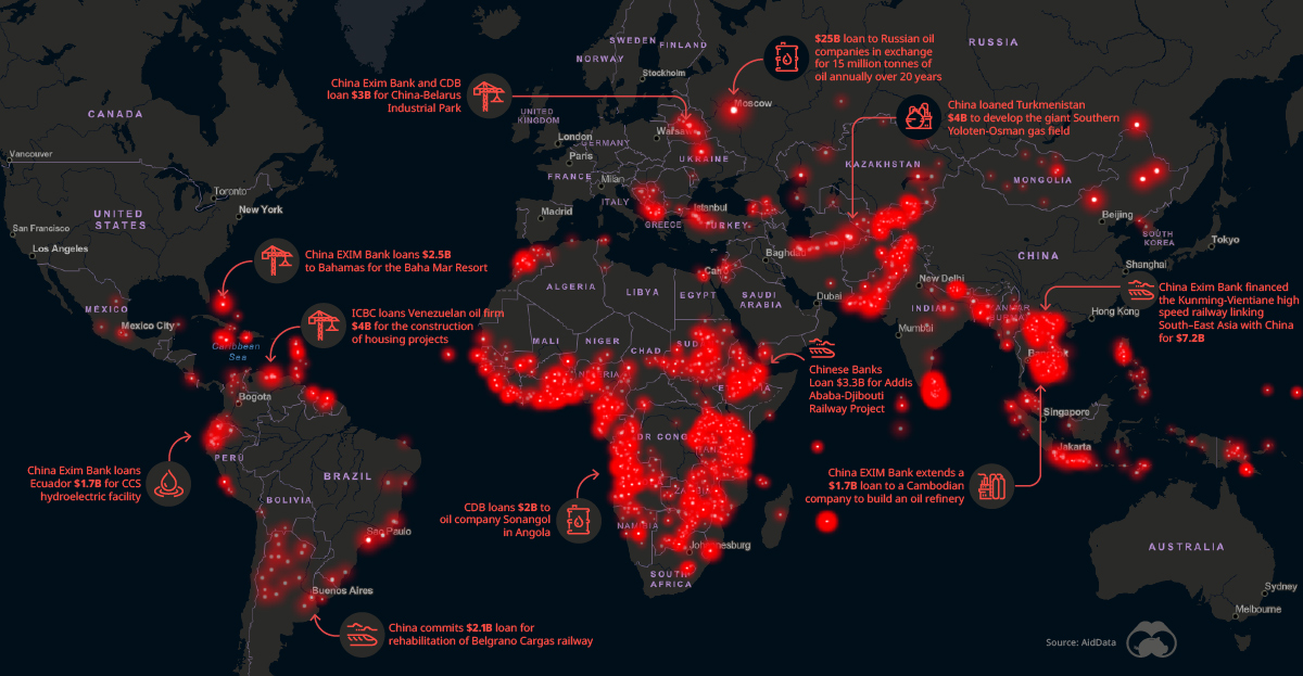
How Chinese Financing is Fueling Megaprojects Around the World
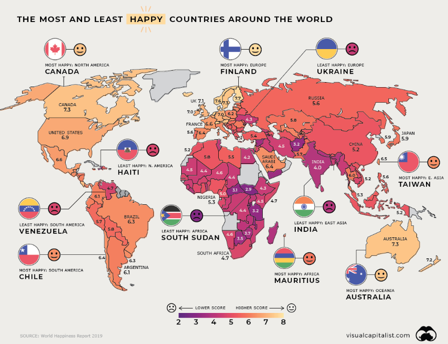
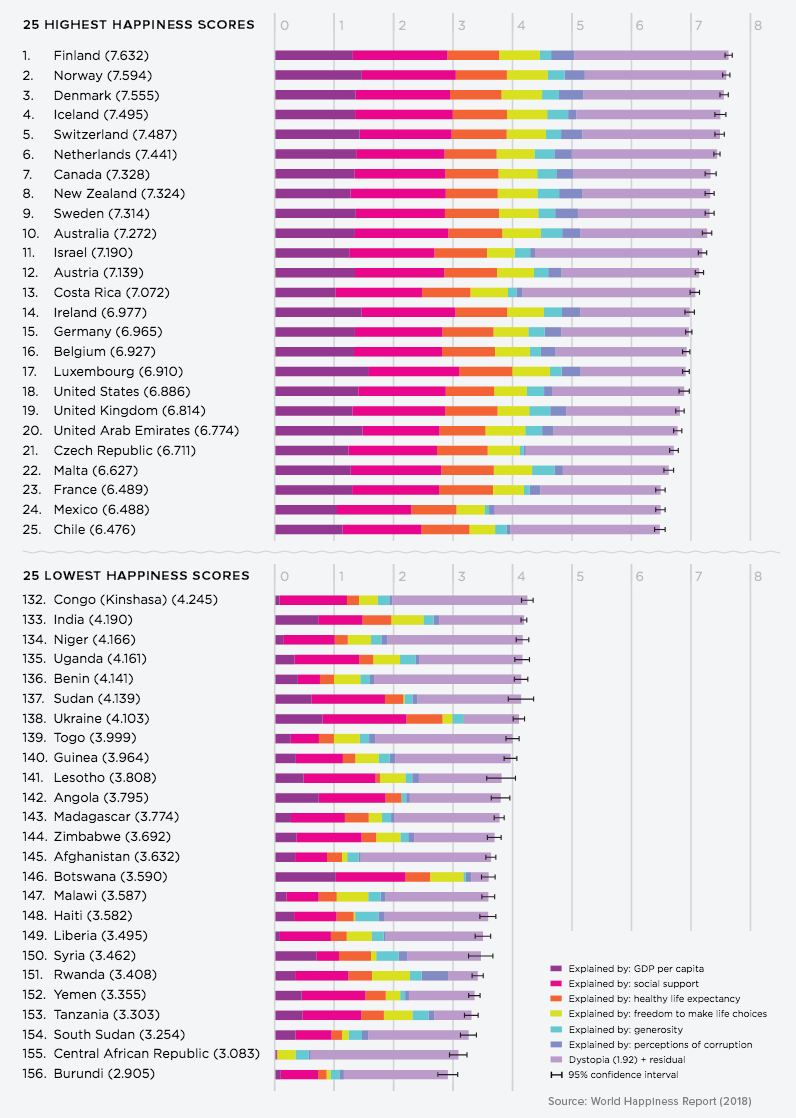
Visualizing the Happiest Country on Every Continent

A History of Revolution in U.S. Taxation
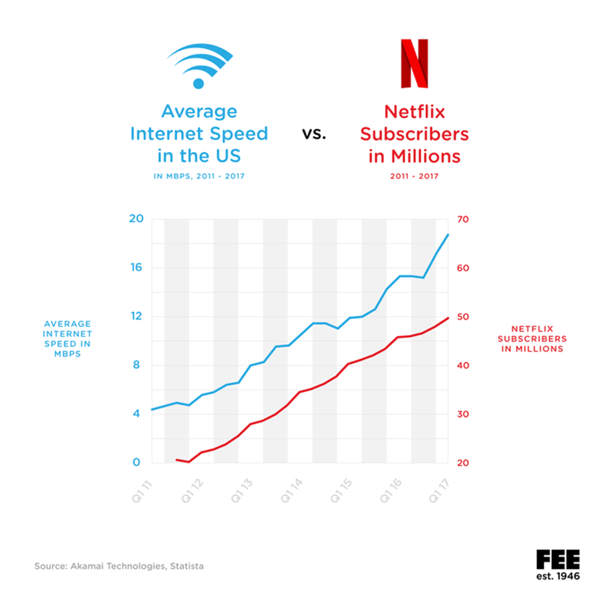
What Streaming Services Teach Us about Economics
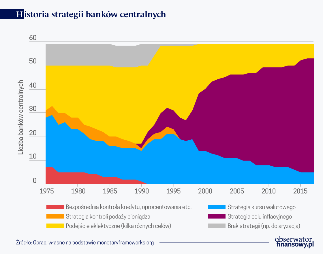
Trzy dekady strategii celu inflacyjnego
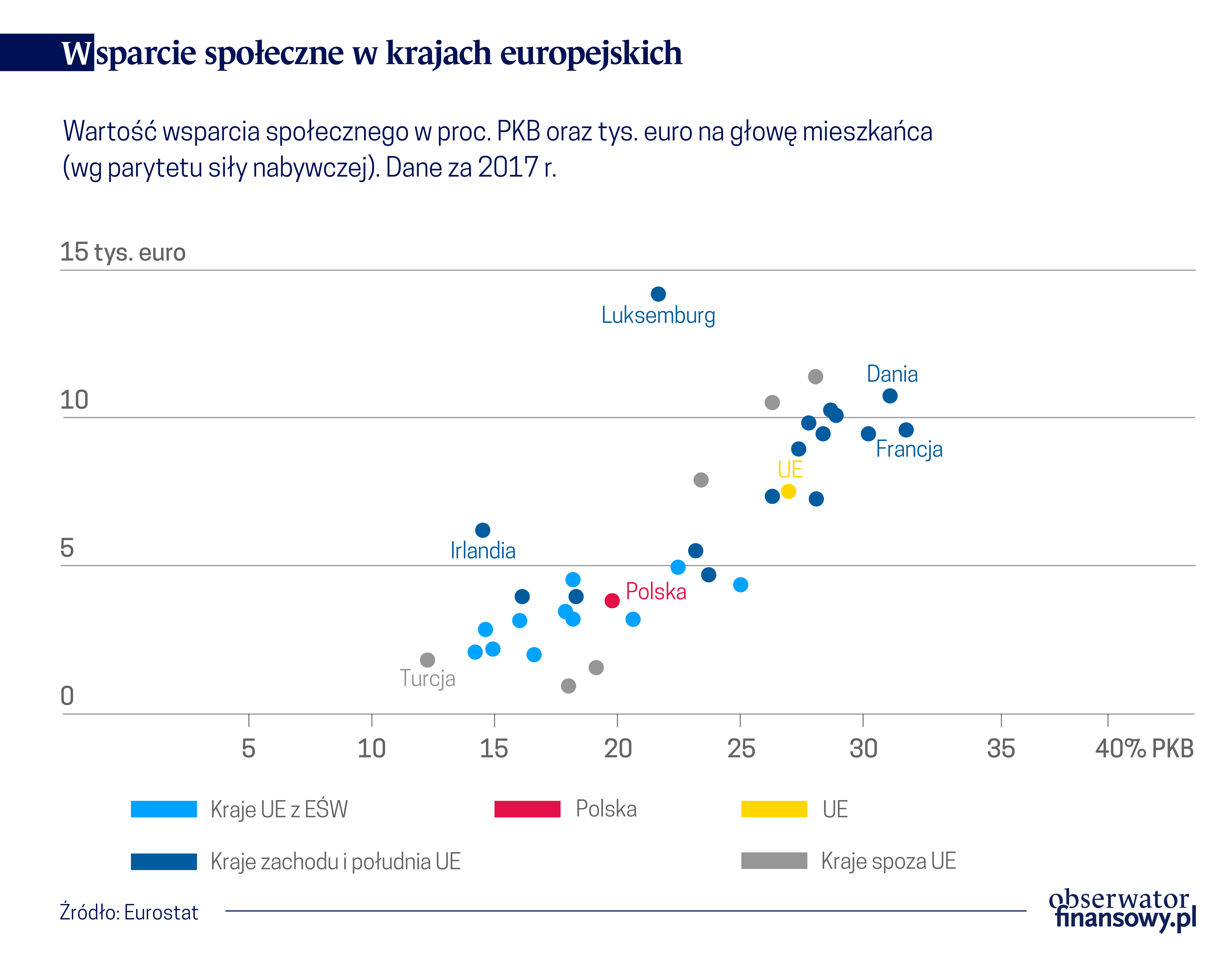
Wydatki społeczne rosną, ale jeszcze nie ciążą
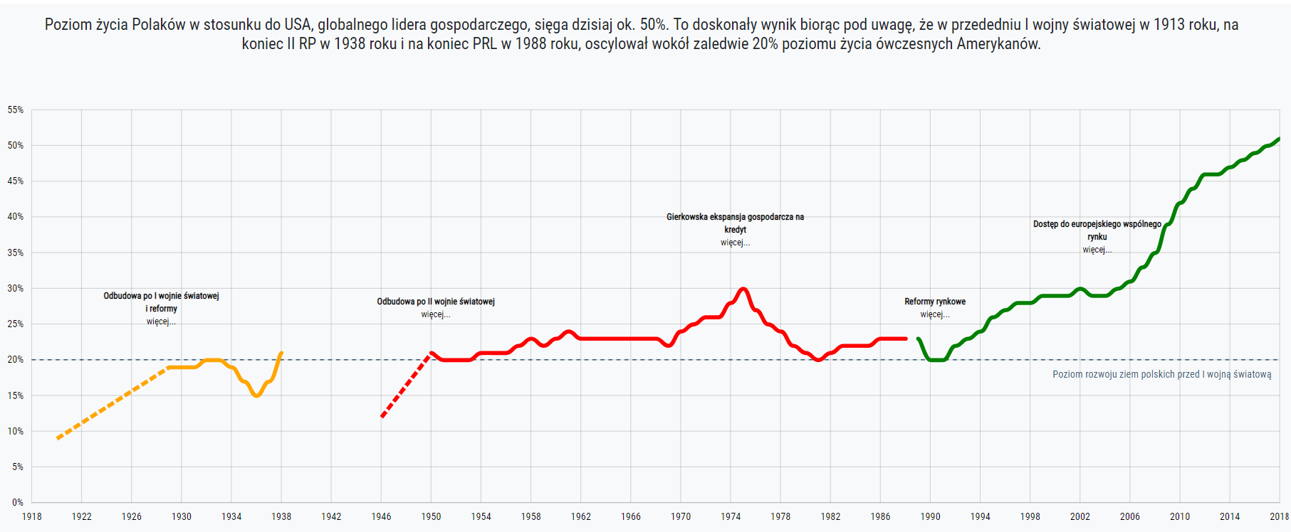
Polski cud gospodarczy: droga na Zachód
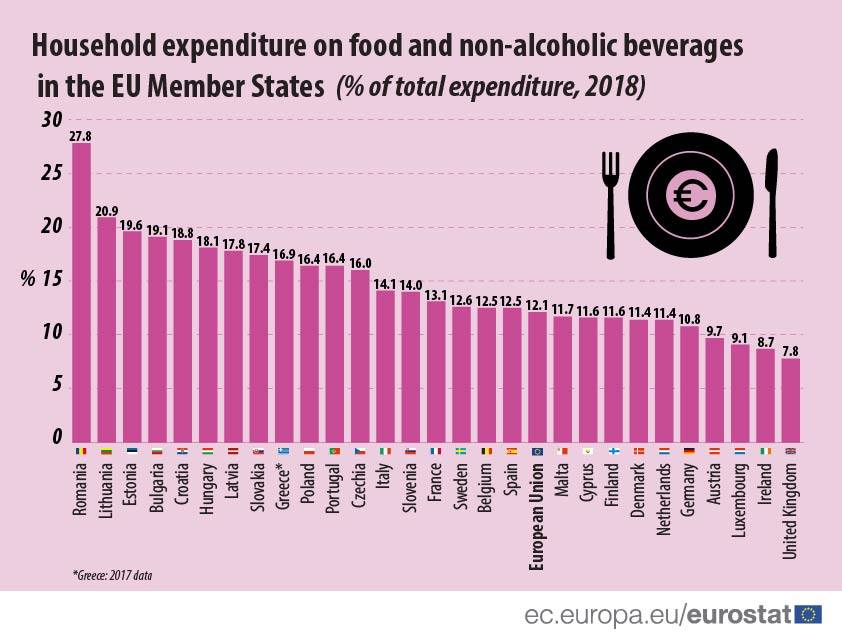
Patrz też: Mniej na jedzenie, więcej na ubrania i rekreację

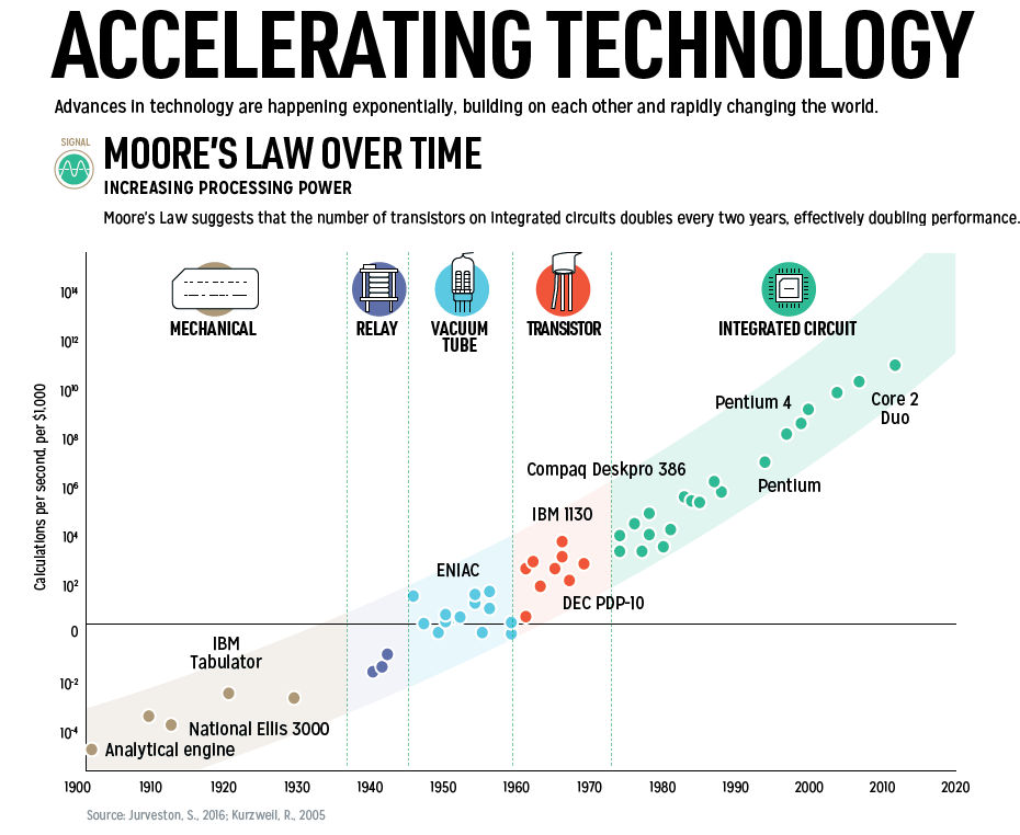
Visualizing Moore’s Law in Action (1971-2019)

9 of the 10 Richest People in the World Are Self-Made Entrepreneurs
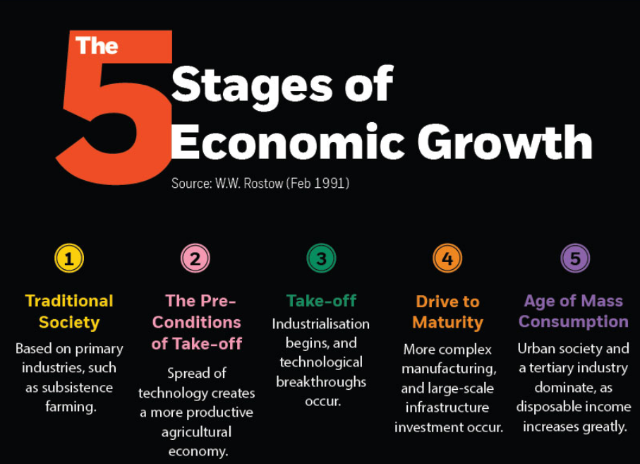
An Investing Megatrend: How Emerging Wealth is Shaping the Future
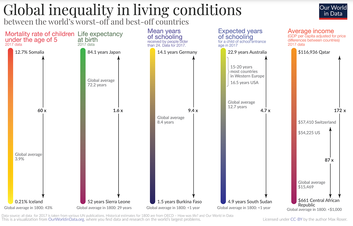
The Global Inequality Gap, and How It’s Changed Over 200 Years

Johan Norberg, Postęp. Dziesięć powodów, by z optymizmem patrzeć w przyszłość
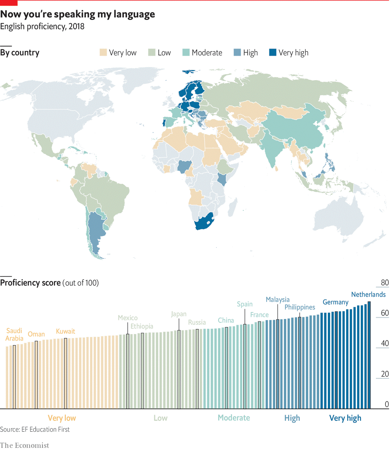
EPI-2019-English
Where are the world’s best English-speakers
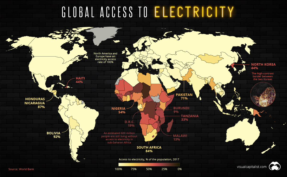
The 1.2 Billion People Without Access to Electricity
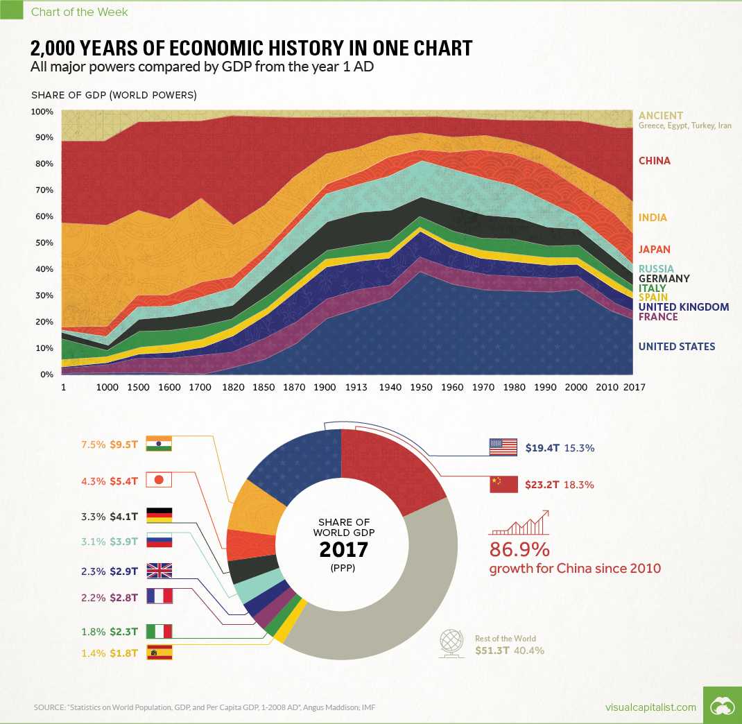
2,000 Years of Economic History in One Chart
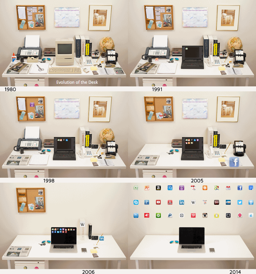
Desktop evolution
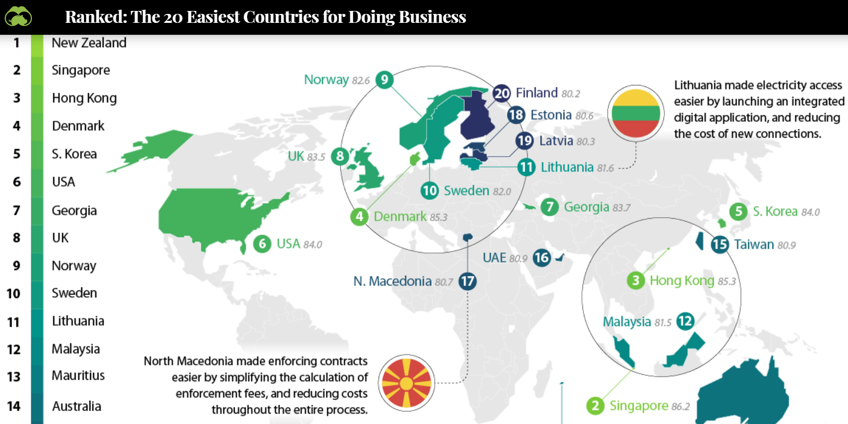
The 20 Easiest Countries for Doing Business

The Race to Invest in the Space Economy

How Does Your Personality Type Affect Your Income?
O typach osobowości tutaj na stronie TRUITY
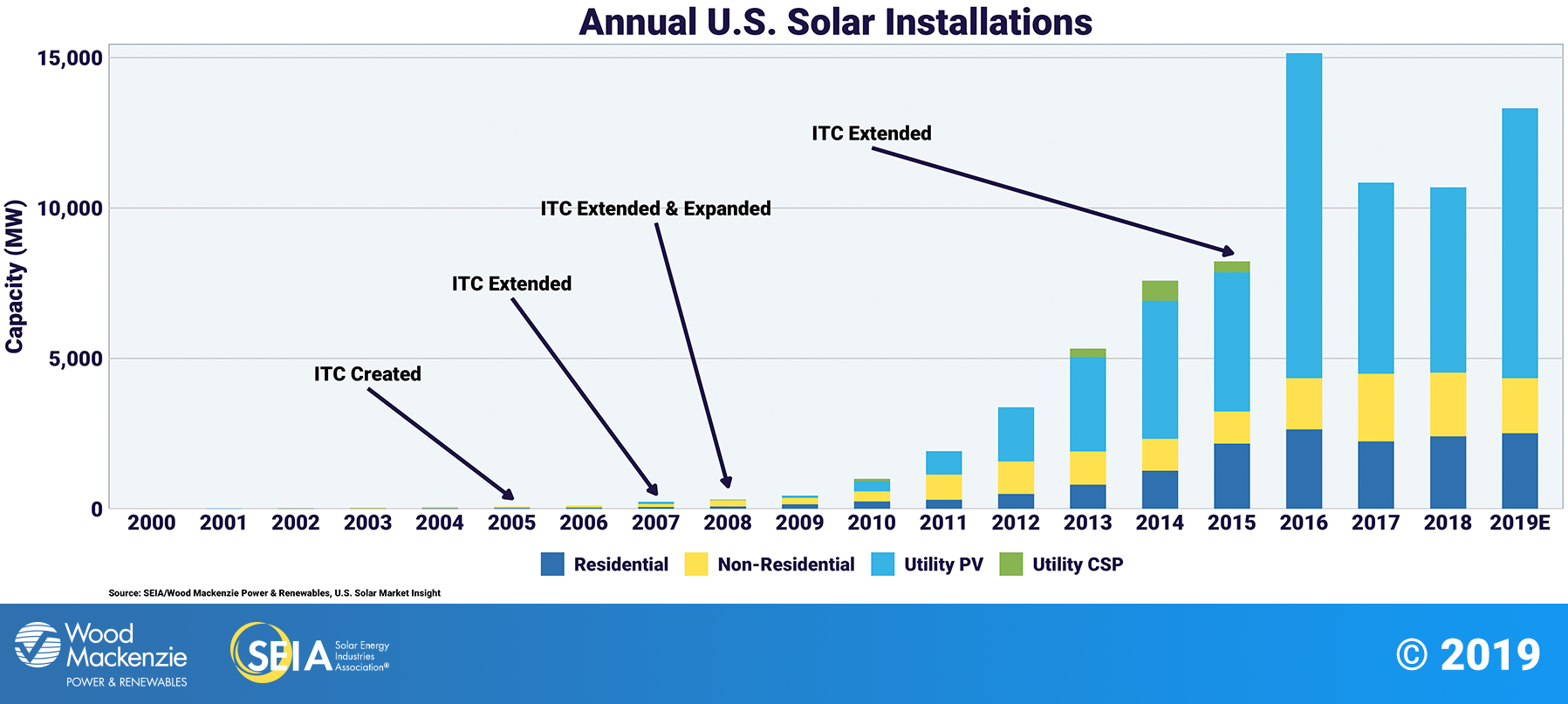
Solar Panels Produce Tons of Toxic Waste—Literally
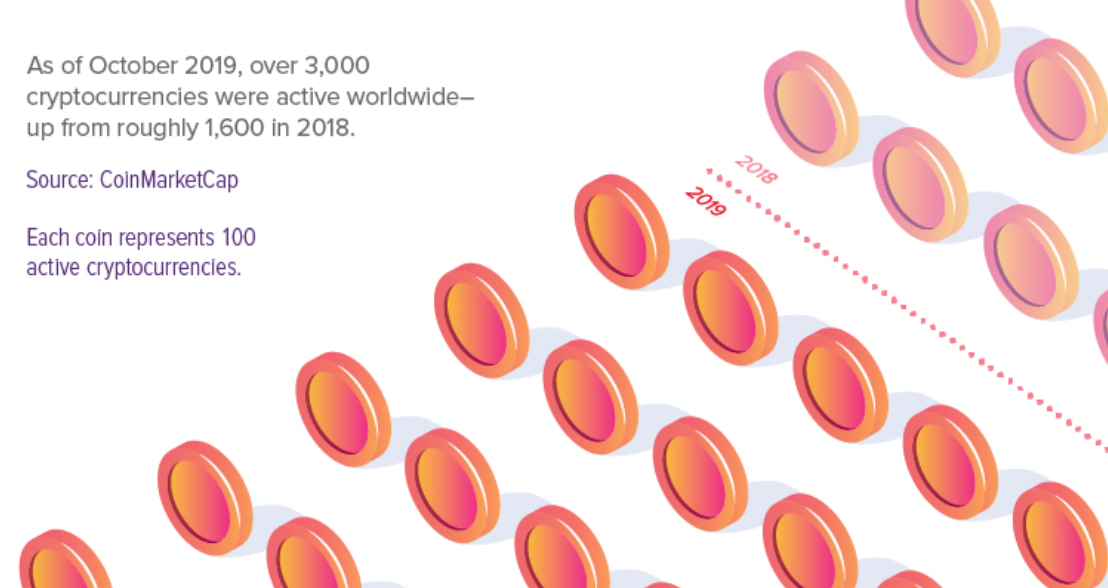
Visualizing the New Cryptocurrency Ecosystem

Countries Ranked by Their Economic Complexity
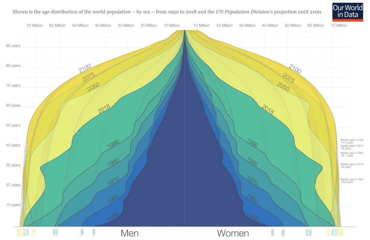
The World Population Pyramid (1950-2100)
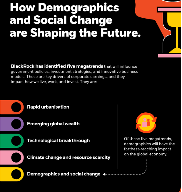
An Investing Megatrend: How Demographics and Social Changes are Shaping the Future
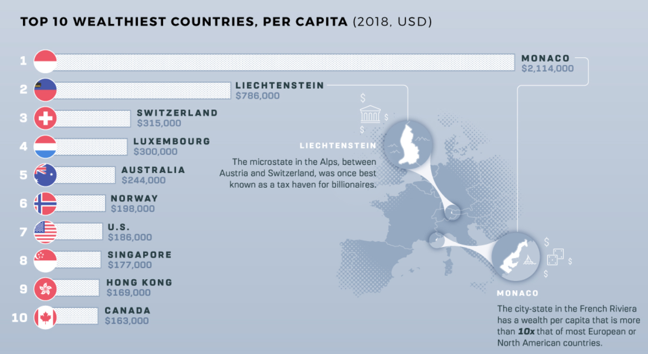
Visualizing the Wealth of Nations
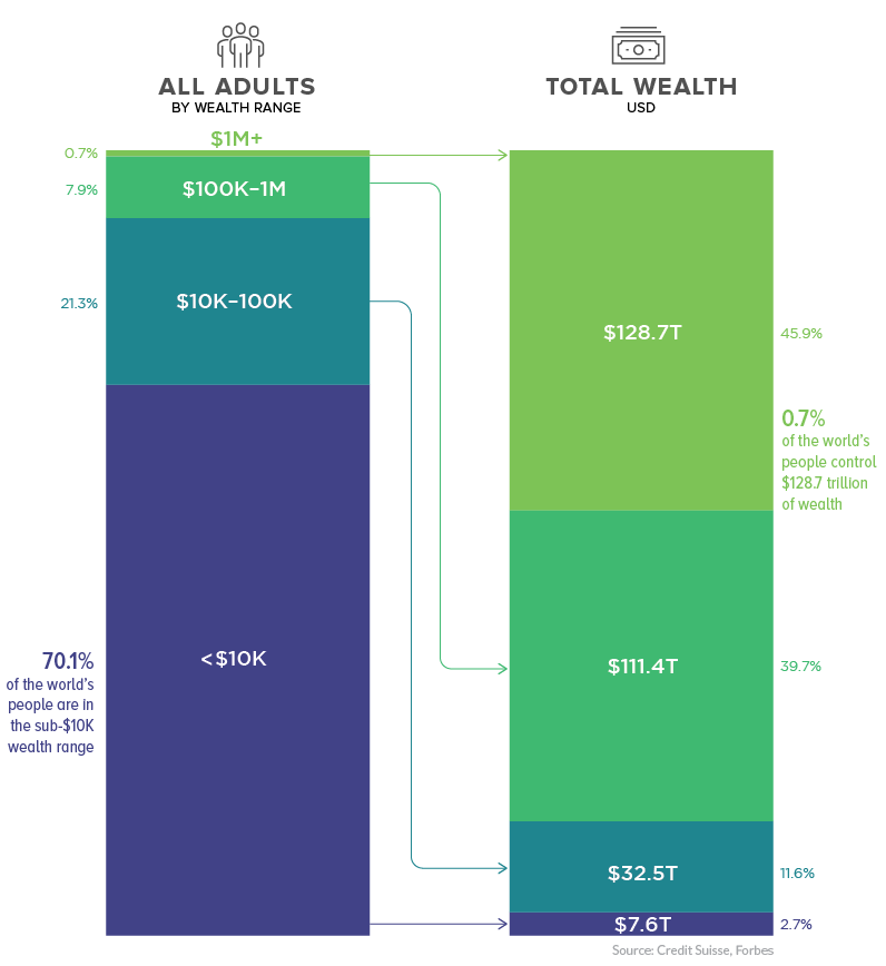
All of the World’s Wealth in One Visualization
Ranked: Which Economies Are the Most Competitive?
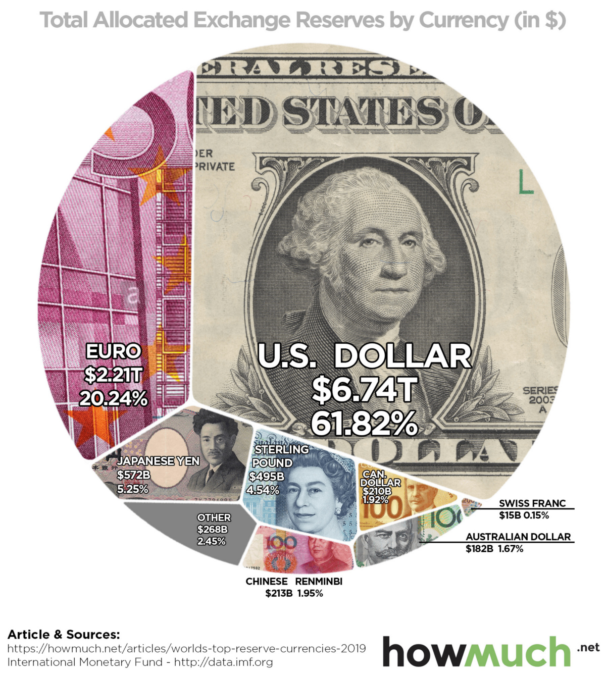
The World’s Most Powerful Reserve Currencies
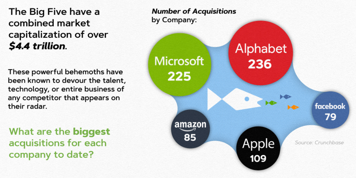
The Big Five: Largest Acquisitions by Tech Company
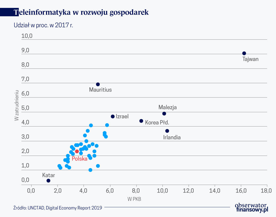
Trudna pogoń za cyfrowymi liderami

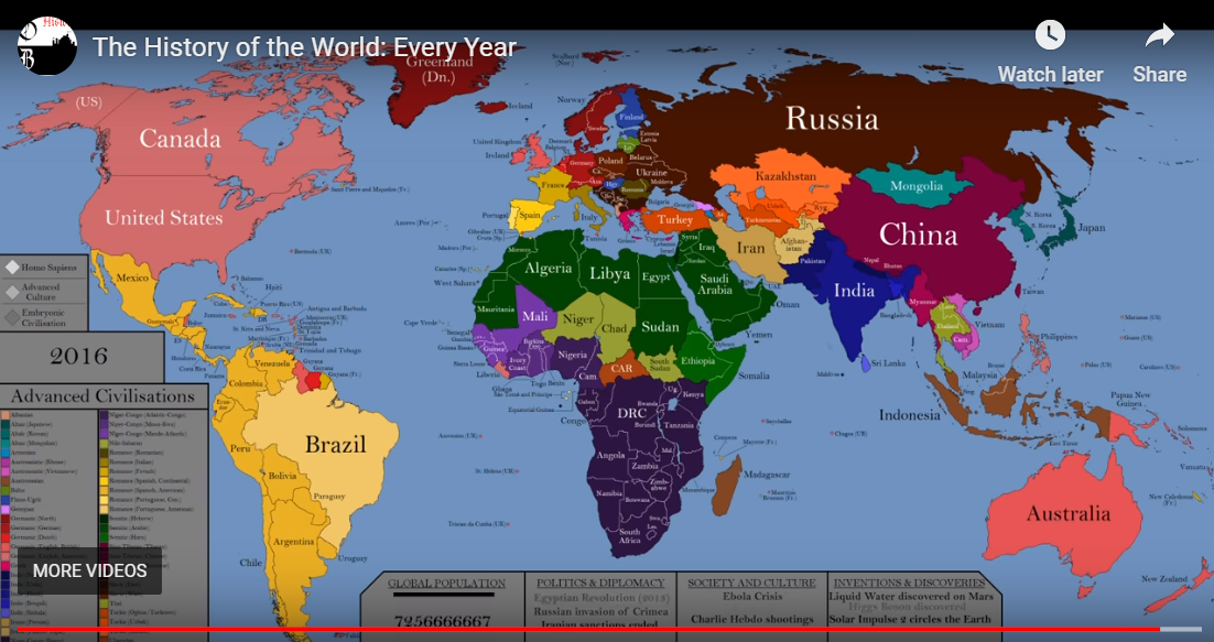
The History of the World, in One Video
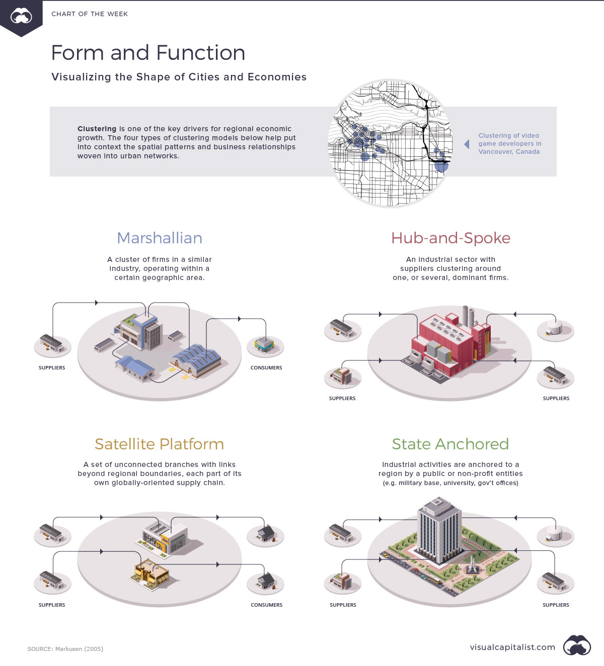
Form and Function: Visualizing the Shape of Cities and Economies
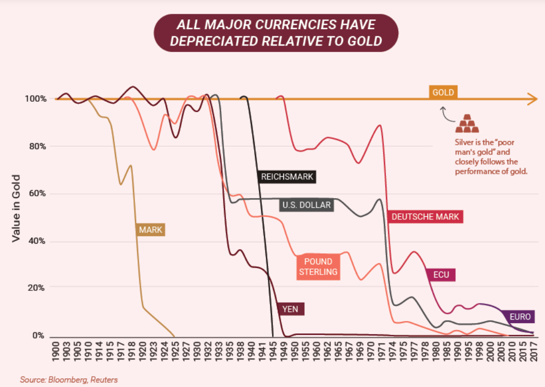
The Silver Series: The Start of A New Gold-Silver Cycle (Part 1 of 3)
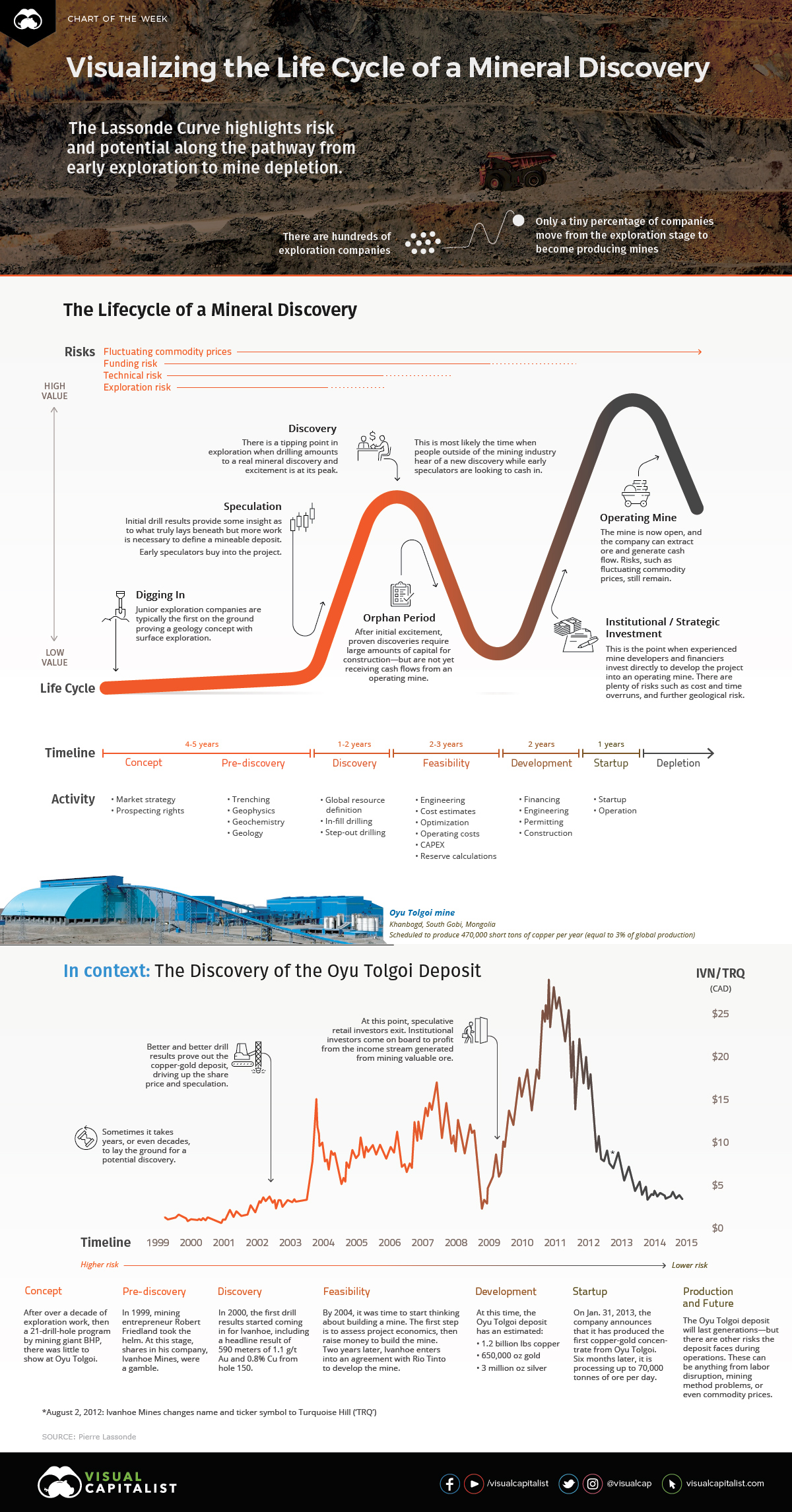
Visualizing the Life Cycle of a Mineral Discovery
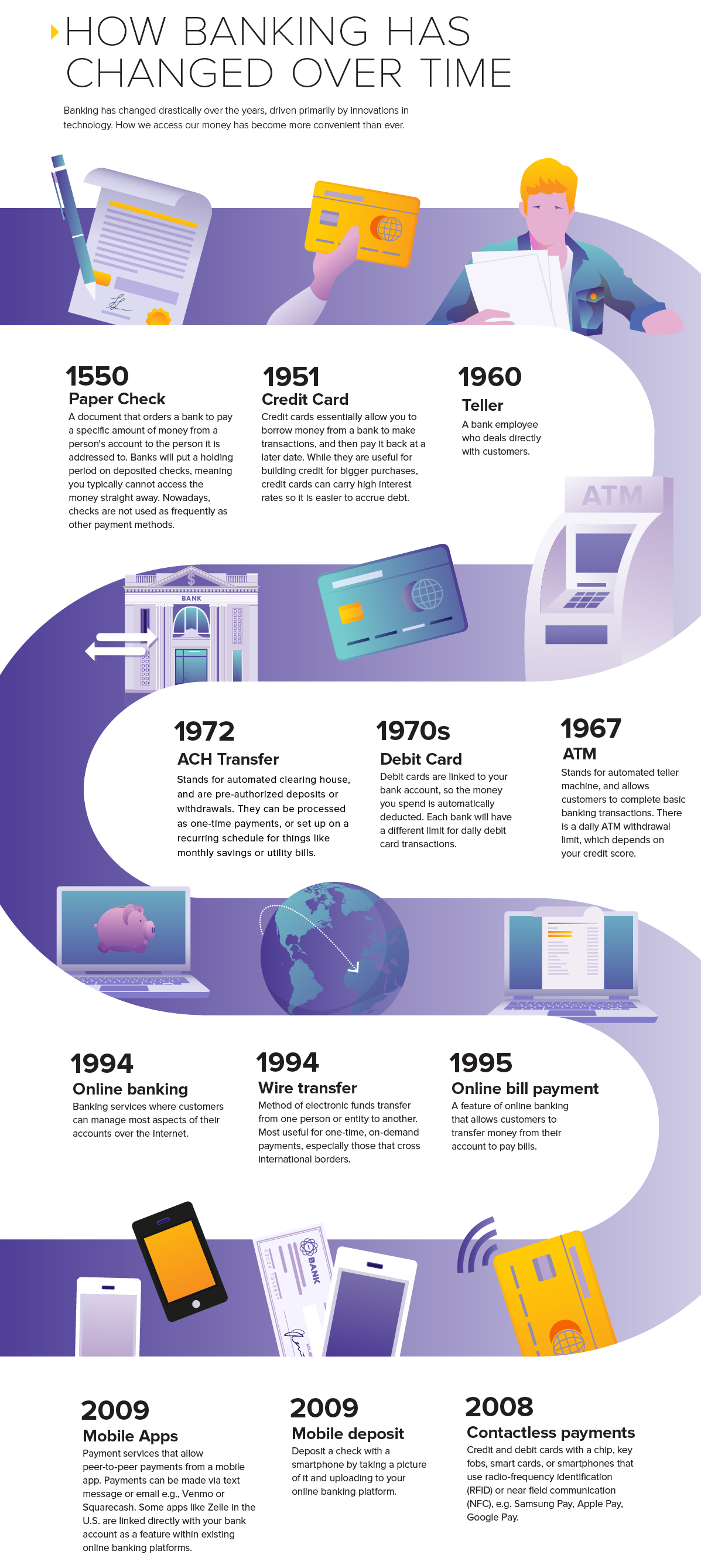
Checking accounts: how you can access your money
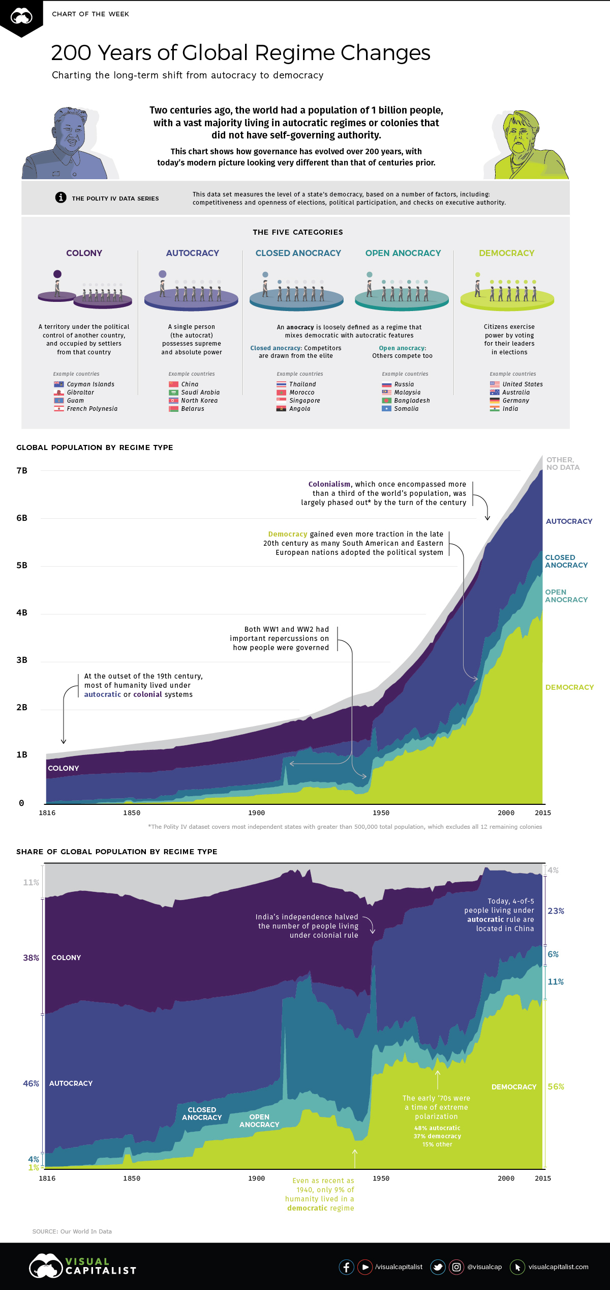
Visualizing 200 Years of Systems of Government
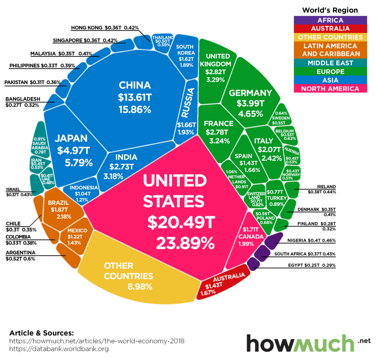
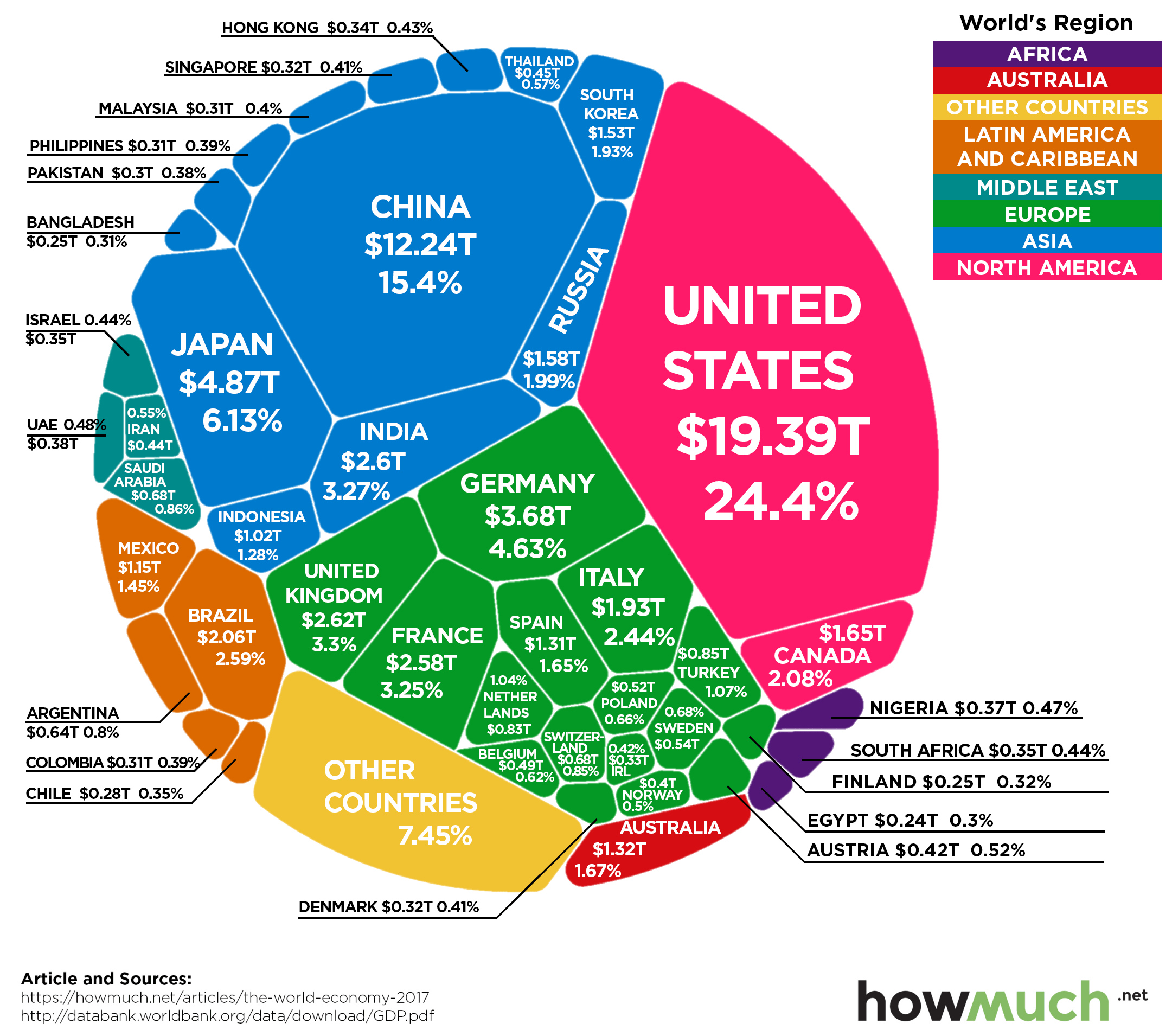
The $86 Trillion World Economy in One Chart
Visualizing the Composition of the World Economy by GDP (PPP)
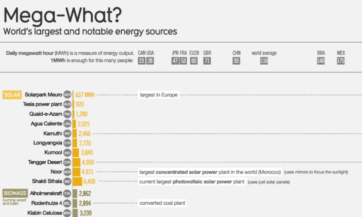
Ranked: The World’s Largest Energy Sources

11 Stunning Visualizations of Gold Show Its Value and Rarity
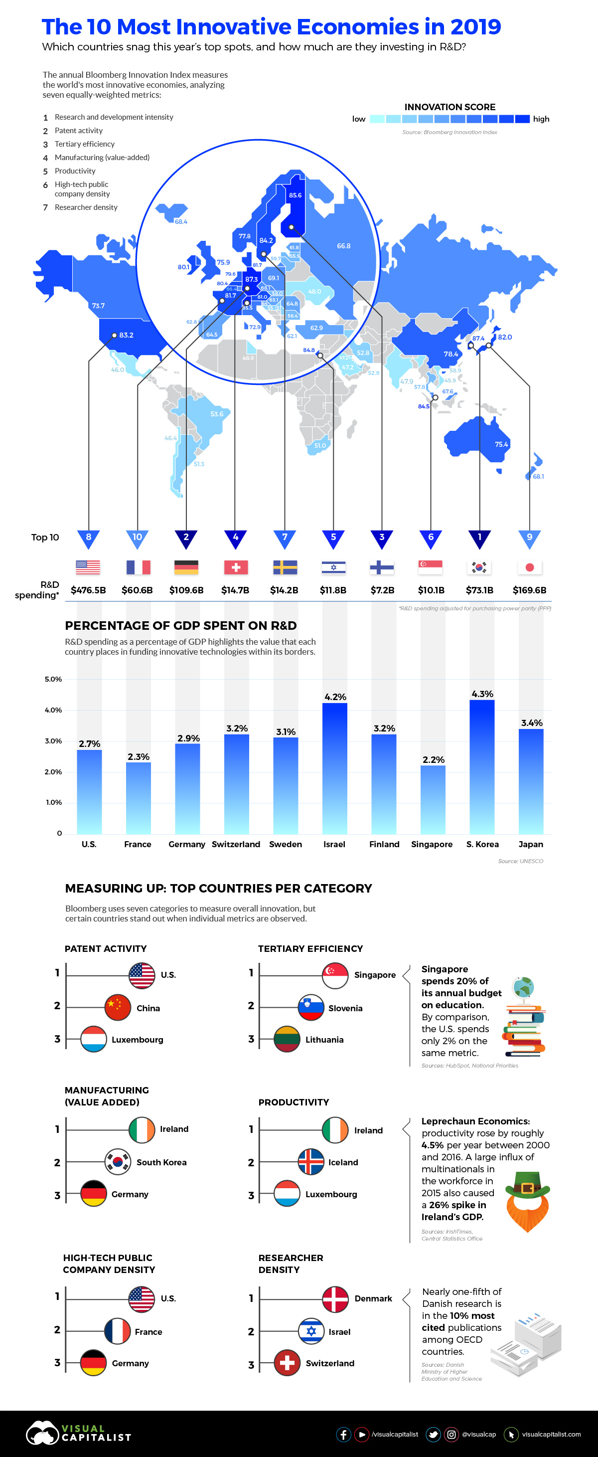
Visualizing the World’s Most Innovative Economies
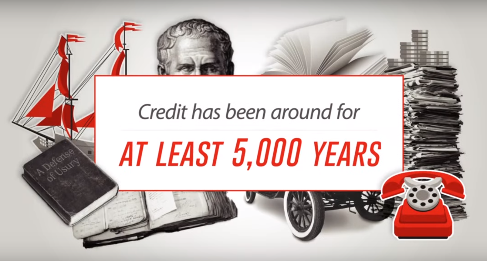
Visualizing the Evolution of Consumer Credit (Wcześniejszy wpis)
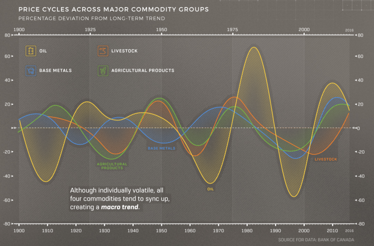
What is a Commodity Super Cycle?

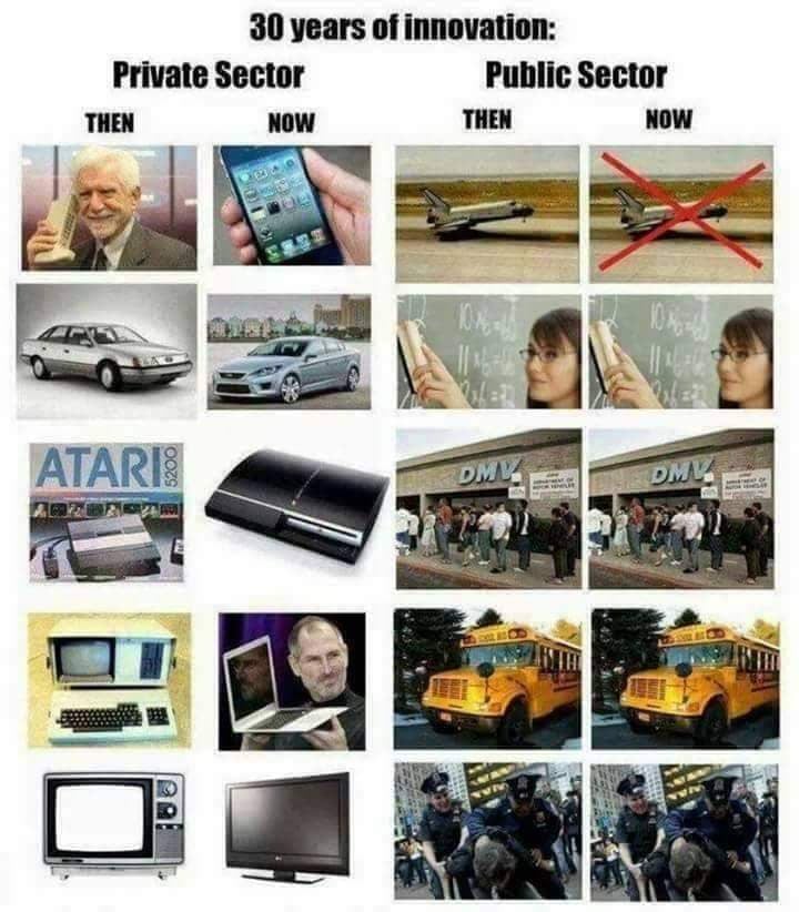
30 lat innowacji w sektorze prywatnym i publicznym
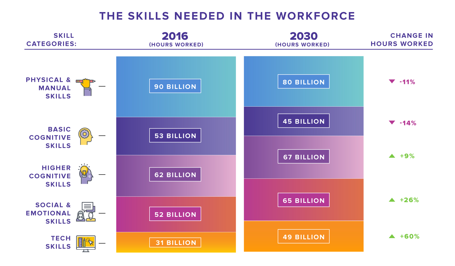
Rise of the robots: how can the next generation compete?
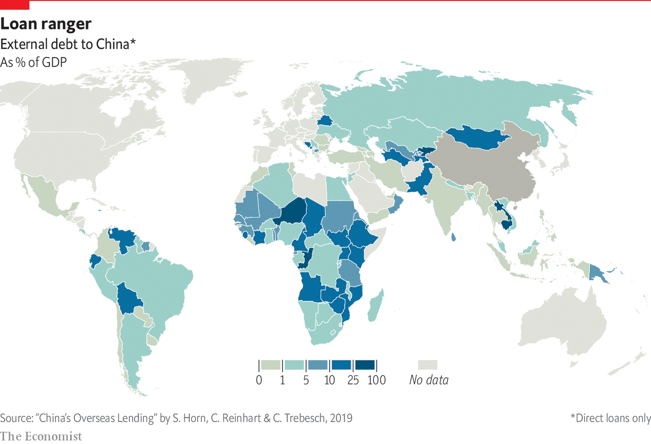
Chinese loans to poor countries are surging

Visualizing the Happiest Country on Every Continent
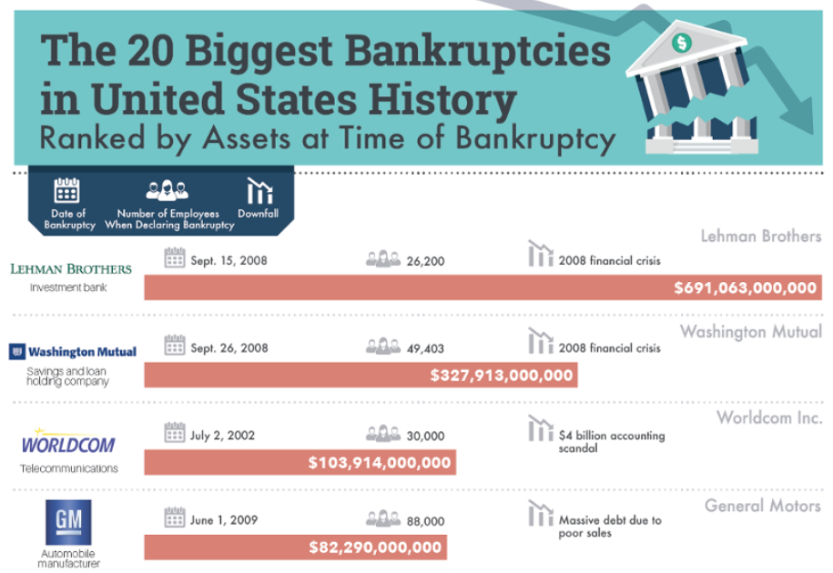
The 20 Biggest Bankruptcies in U.S. History
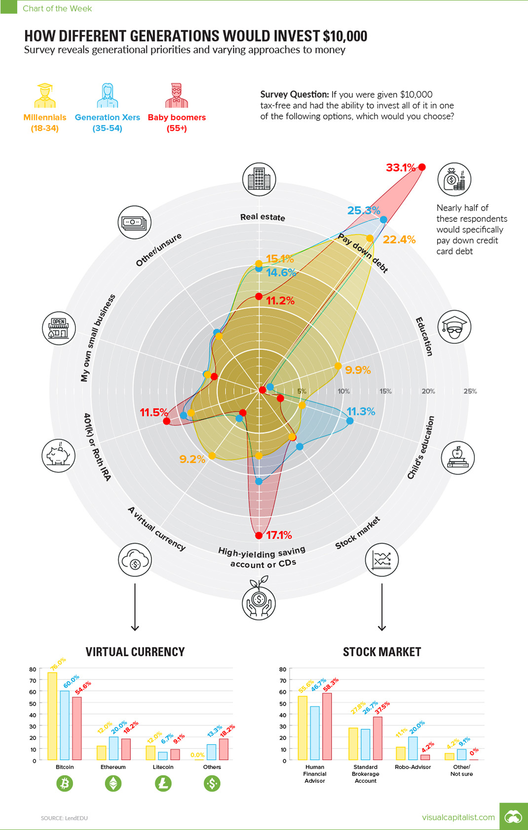
This Chart Shows How Different Generations Would Invest $10,000
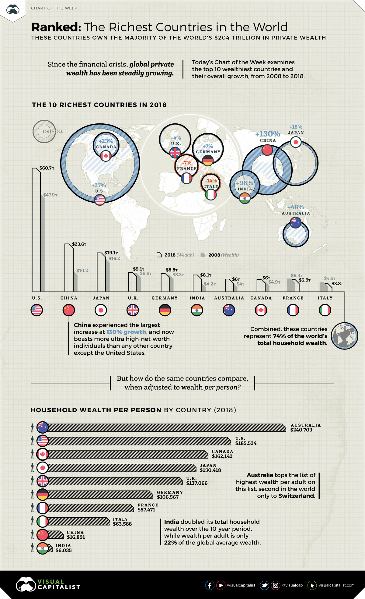
Ranked: The Richest Countries in the World

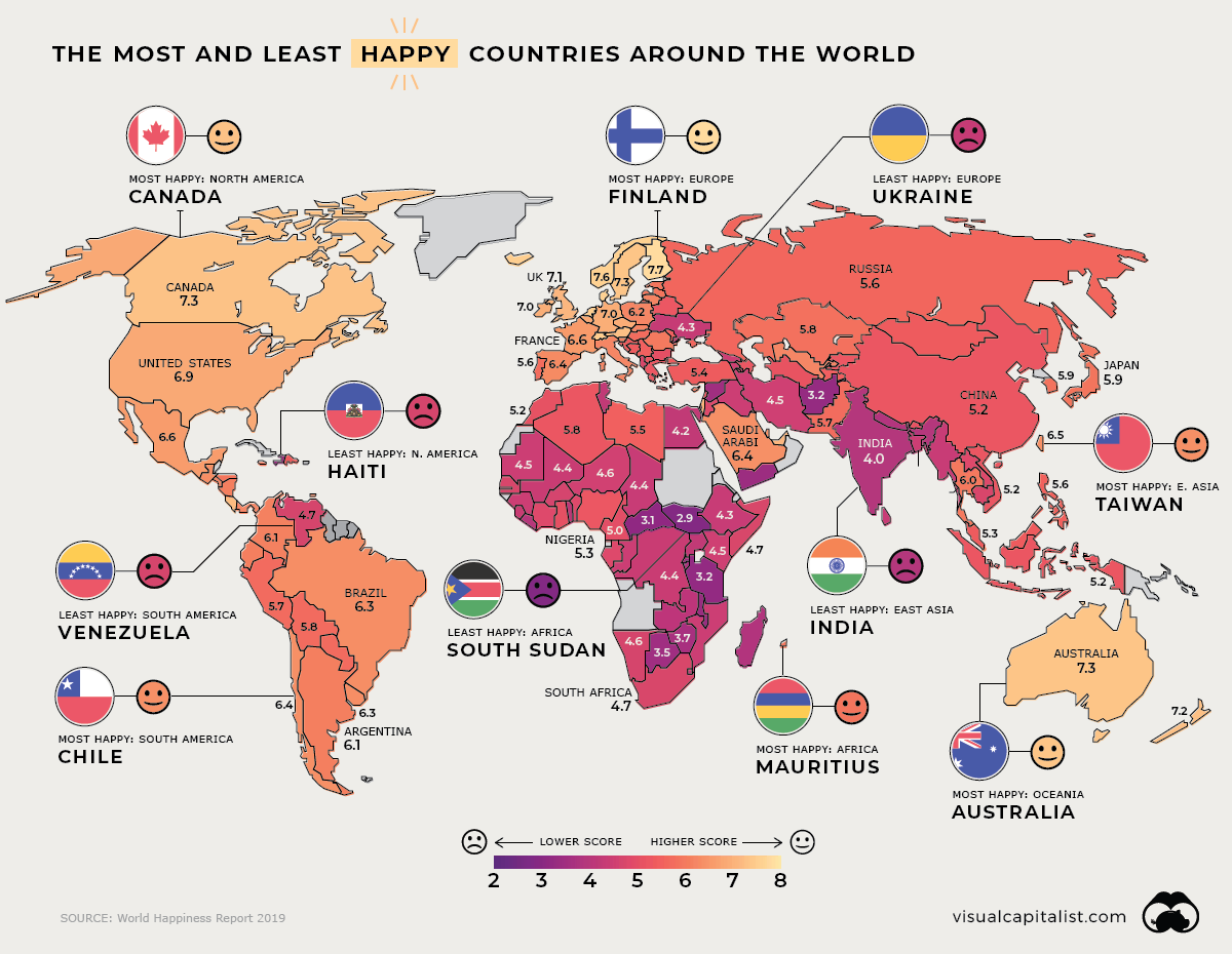
Visualizing the Happiest Country on Every Continent

Visualizing the AI Revolution in One Infographic
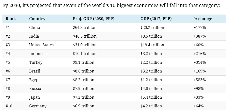
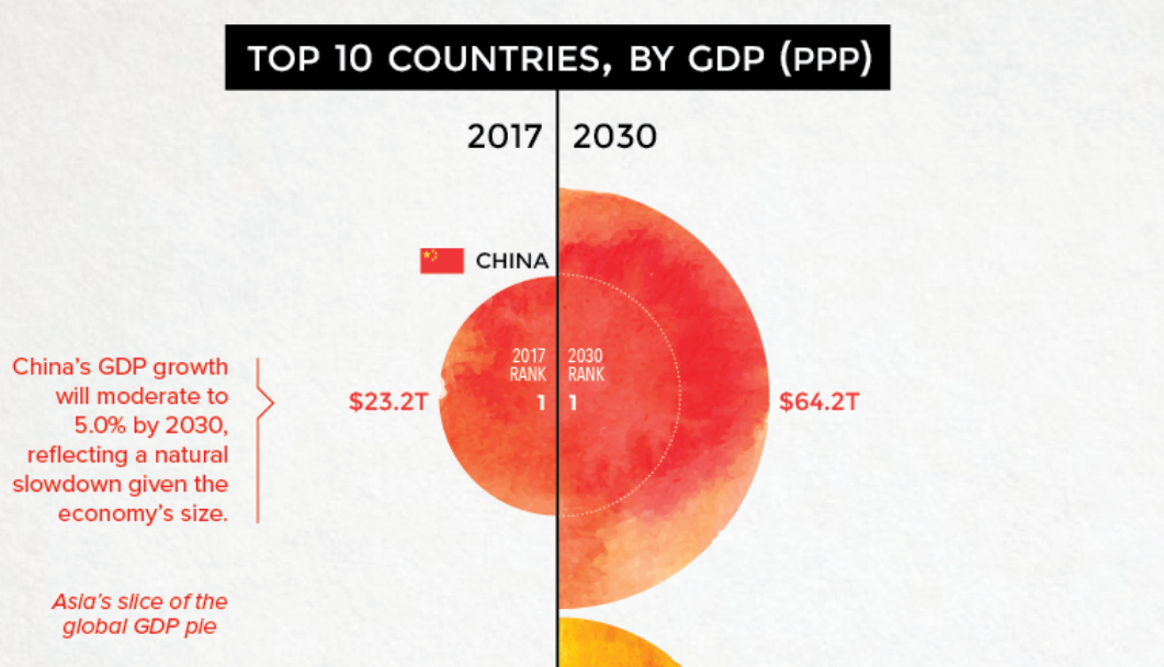
Animation: The Biggest Economies in 2030
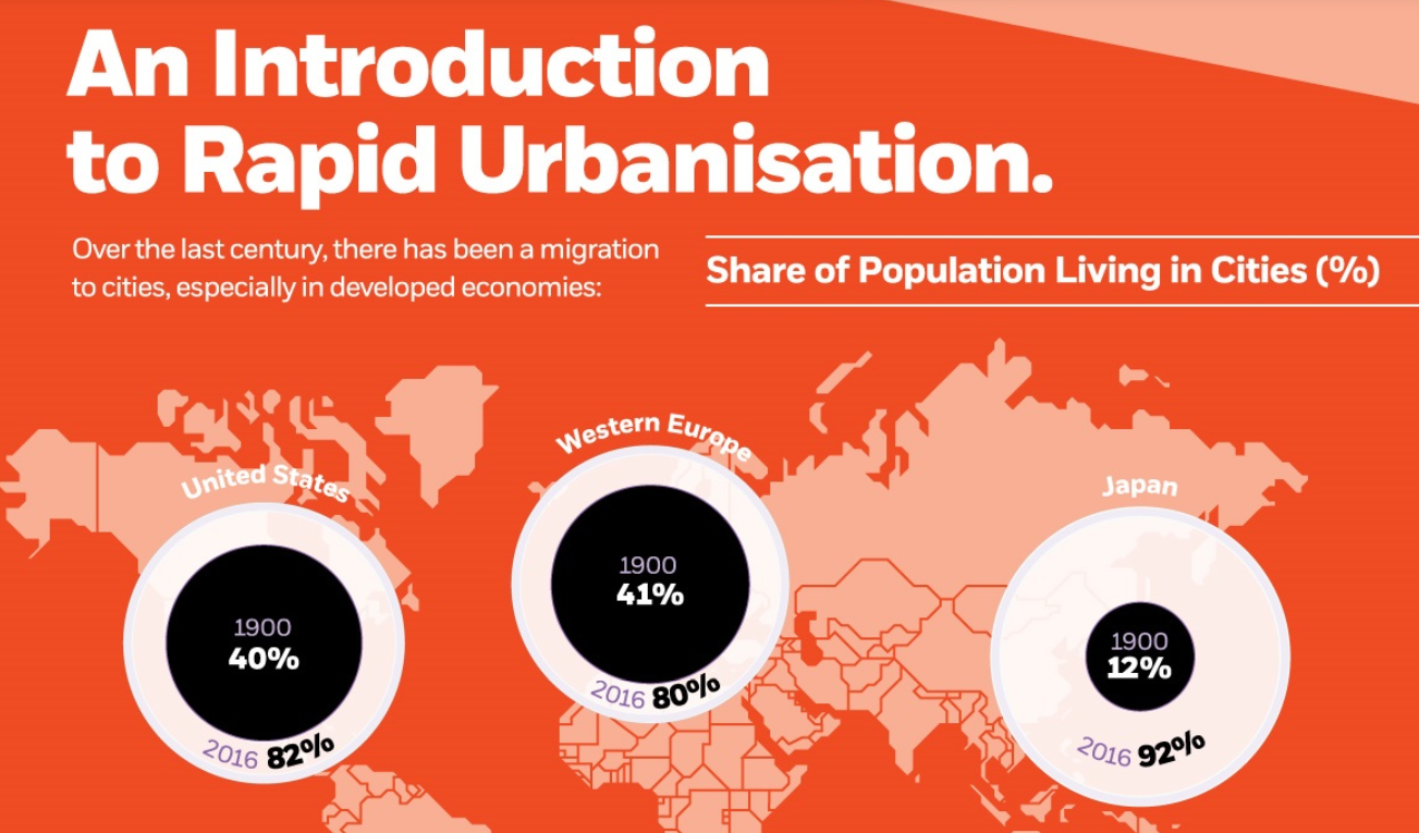
Investing Megatrend: How Rapid Urbanisation is Shaping the Future
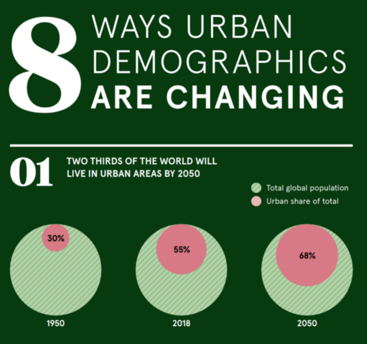
The 8 Ways Urban Demographics are Changing
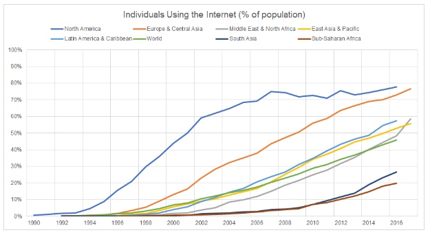
The miracle we all take for granted
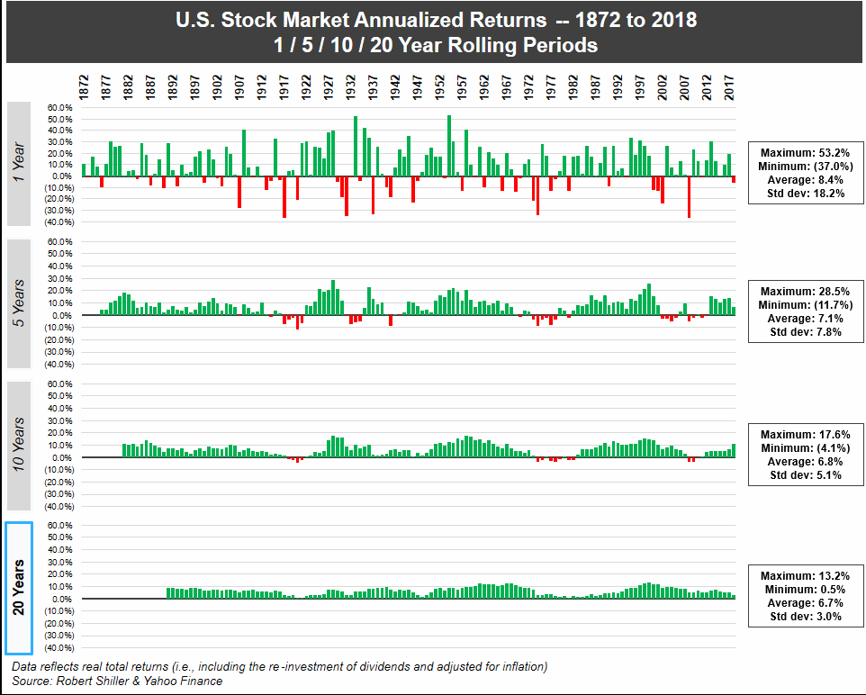
Stock Market Returns Over Different Time Periods (1872-2018)
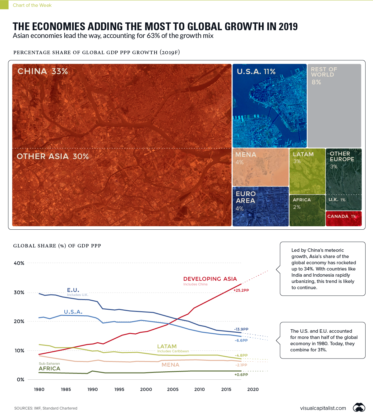
The Economies Adding the Most to Global Growth in 2019
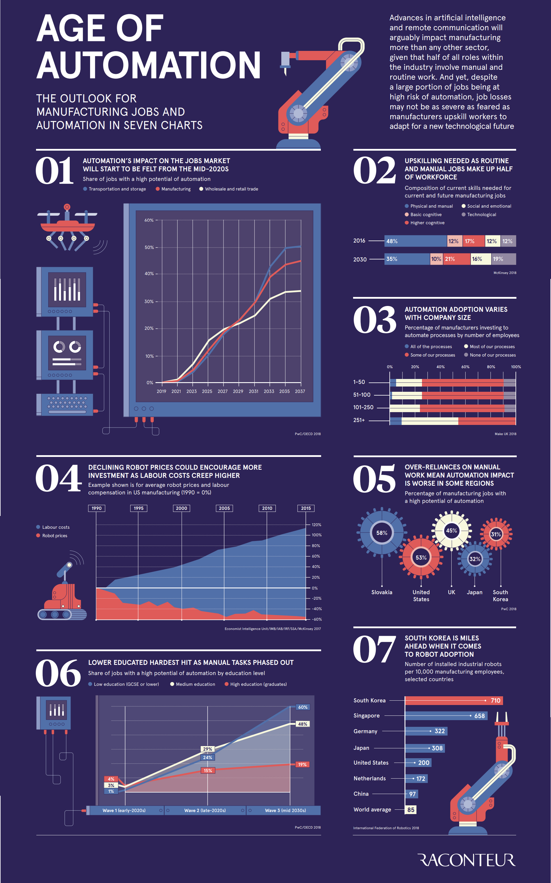
The Outlook for Automation and Manufacturing Jobs in Seven Charts
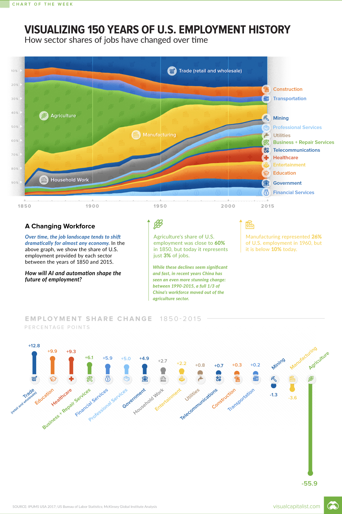
Visualizing 150 Years of U.S. Employment History
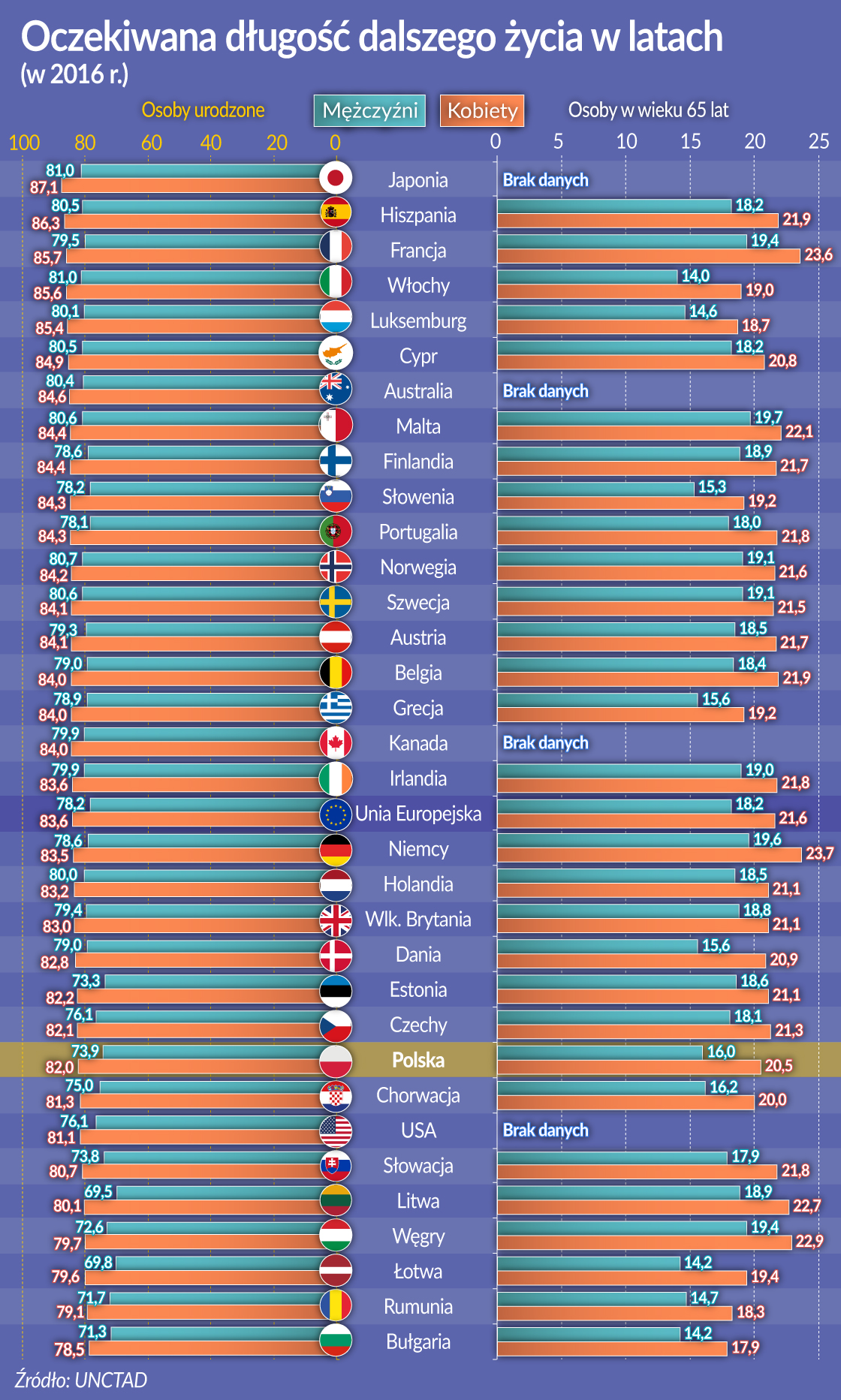
Komu najbliżej do 100 lat życia
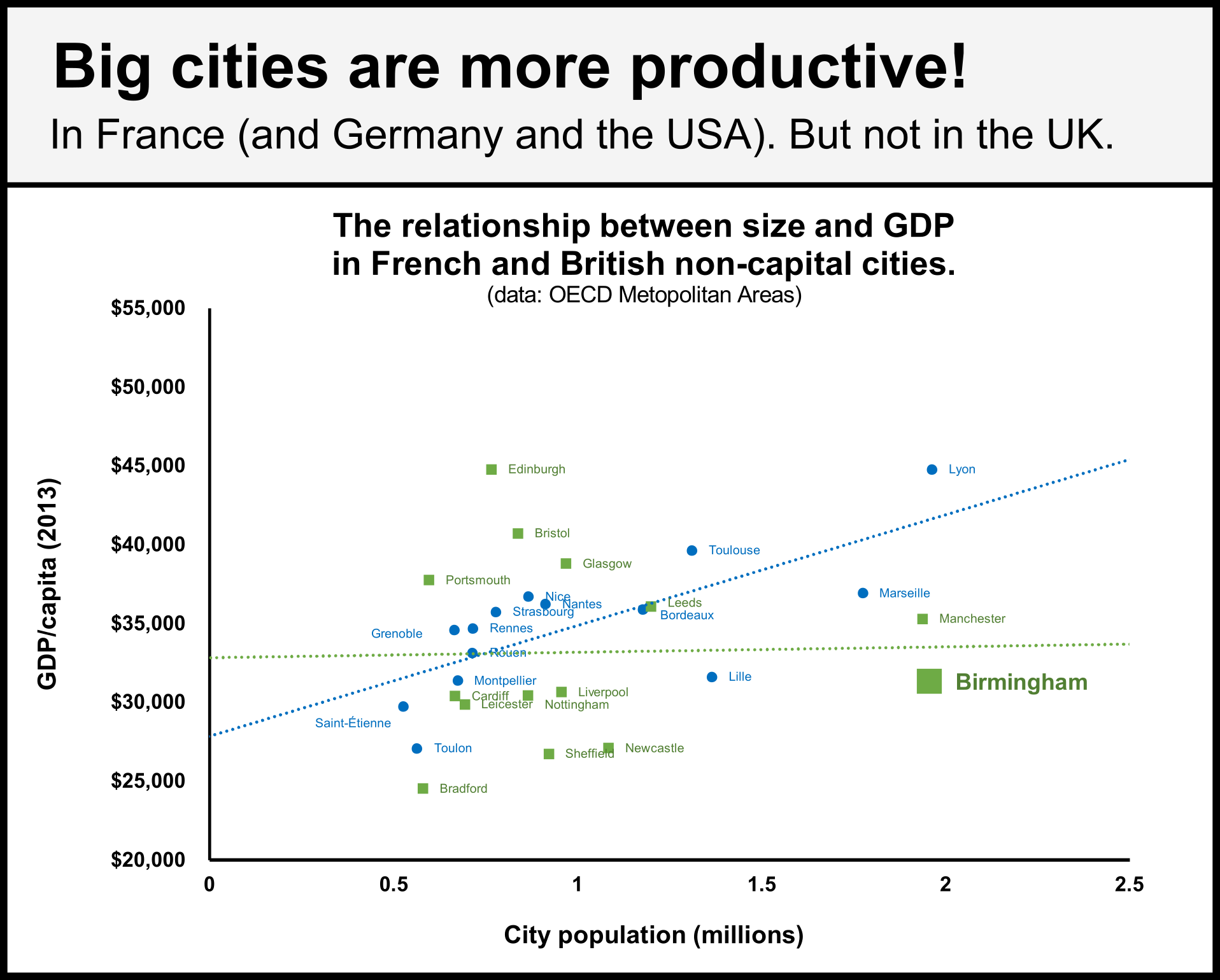
Real Journey Time, Real City Size, and the disappearing productivity puzzle
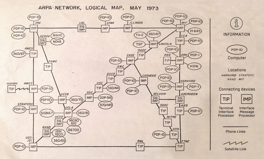
This Map Shows the Extent of the Entire Internet in 1973
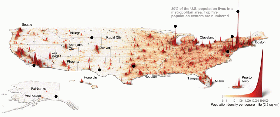
Visualizing 200 Years of U.S. Population Density
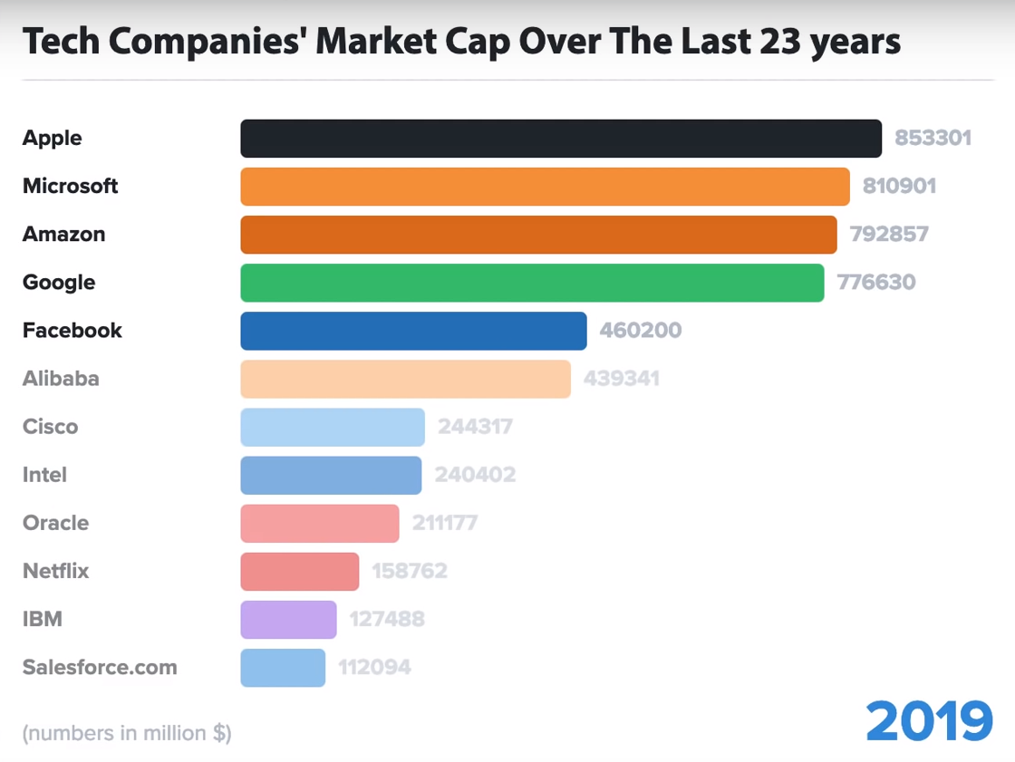
Animation: The Biggest Tech Companies by Market Cap Over 23 Years
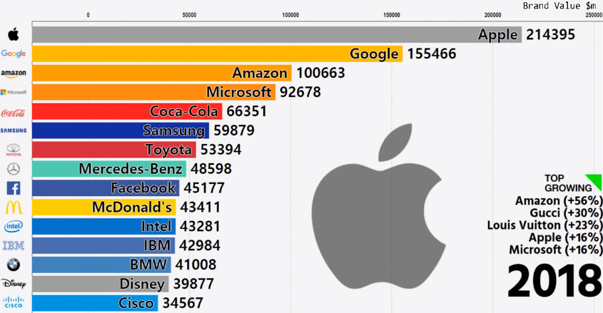
Animation: The Top 15 Global Brands (2000-2018)
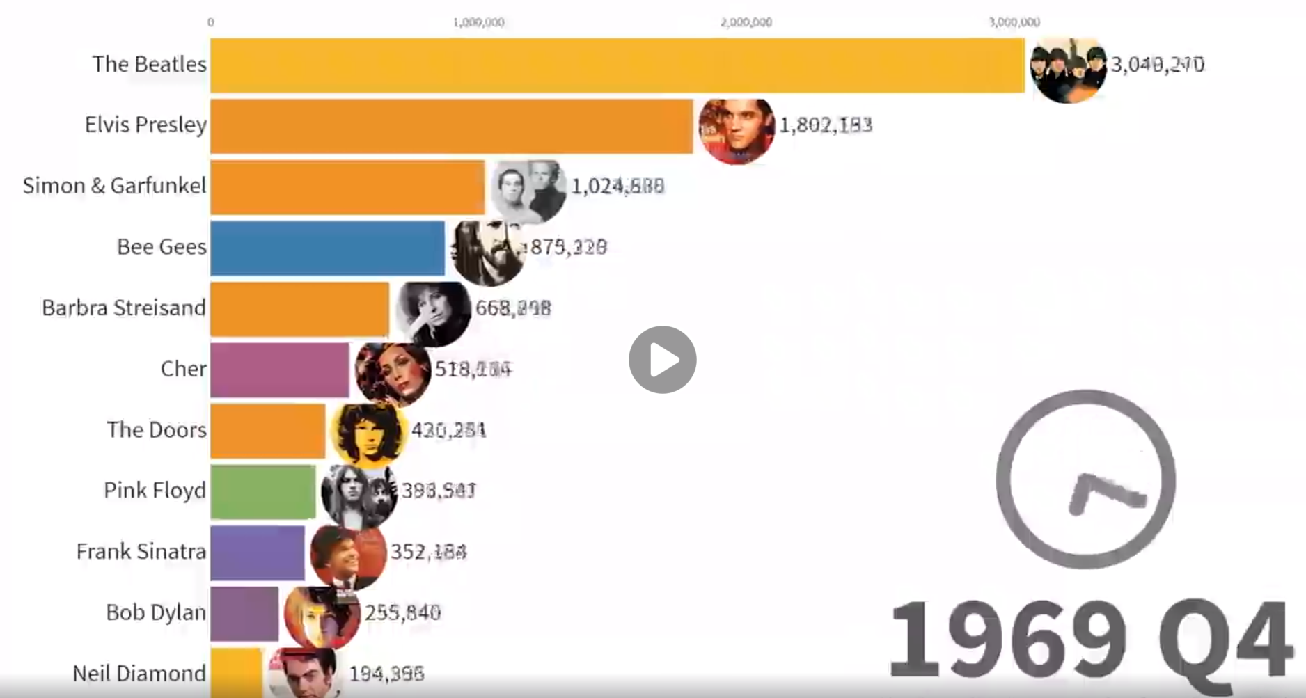
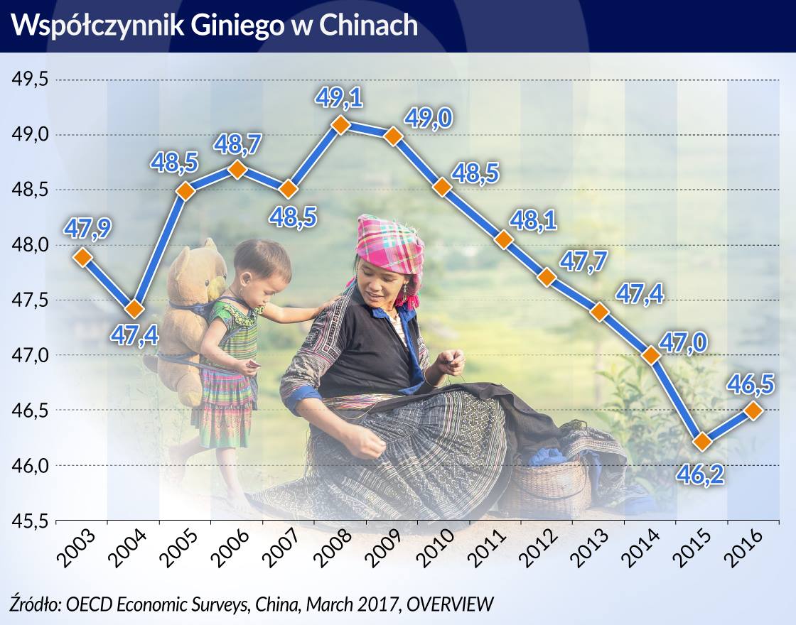
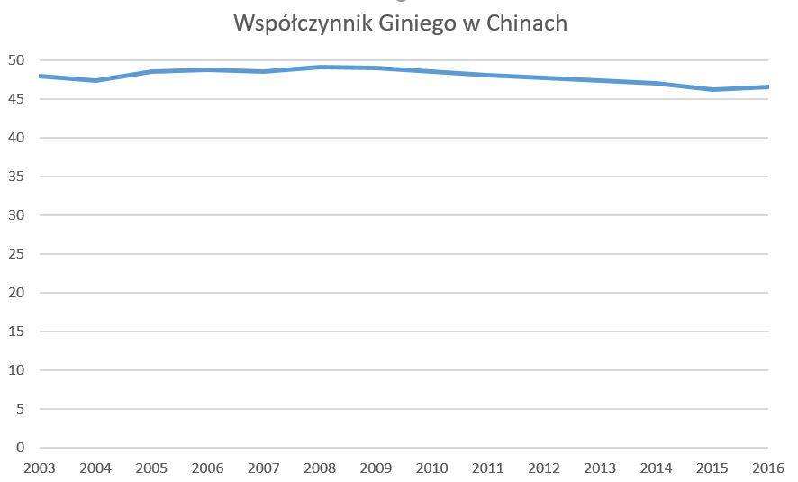
Z wpisu na FB 26 lutego 2018 r:
“Chciałbym podjąć problem niezbyt rzetelnego (a niekiedy nawet nieuczciwego) przedstawiania graficznego danych statystycznych. Problem, z którym często się stykam. A pretekstem jest wykres, który załączono w, skądinąd ciekawym, artykule Witolda Gadomskiego ‘Piramida kłamstwa”. https://www.obserwatorfinansowy.pl/…/banko…/piramida-klamst/
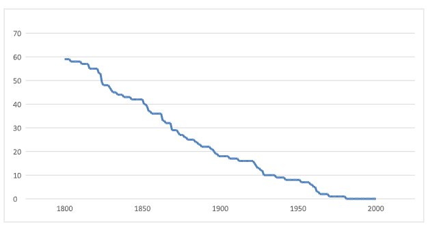
Ten ładnie wyglądający wykres po lewej stronie miał być ilustracją fragmentu tekstu odnoszącego się do istnienia nierówności w Chinach („Współczynnik Giniego, pokazujący poziom nierówności, wynosi w Chinach przeszło 45 i jest typowy dla krajów III świata. Grupy znajdujące się w trudnej sytuacji, niemające szansy otrzymania wysoko płatnej pracy, są podatne na reklamy pokazujące sposoby łatwego wzbogacenia się.”)
Spokojnie można byłoby pozostać na tym stwierdzeniu. Najprawdopodobniej nadgorliwy redaktor, bez wiedzy Gadomskiego, chcą uatrakcyjnić tekst, zamieścił ładnie wyglądający wykres (ten górny). Patrząc na niego odnieść można wrażenie, że w ostatnich latach Chiny osiągnęły sukces w ‘walce z nierównościami” (od 2007 roku krzywa spada). Dopiero po bliższym przyjrzeniu się wykresowi i wartościom współczynnika na osi widać wyraźnie, że te zmiany nic nie znaczą, że jest on od 2003 roku praktycznie na stałym poziomie ok. 47-48 procent. Widać to kiedy narysuje się go w ‘naturalnej skali’ (rysunek dolny). Zrobiłem to w Excelu, wiec dosyć topornym programie. Widać jednak wyrażnie, że zmiany tego współczynnika są nieistotne.
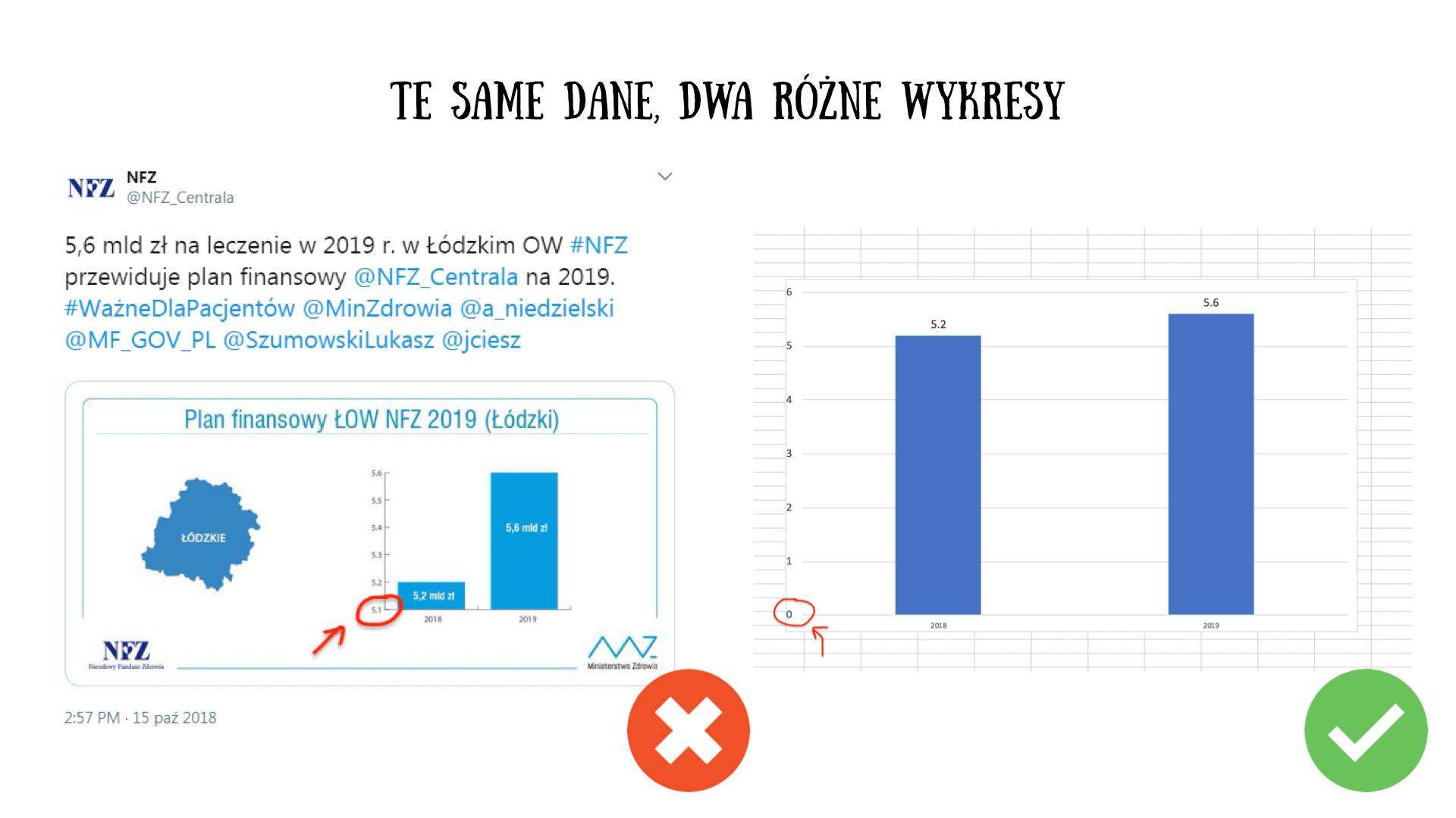
W takim nierzetelnym (bałamutnym) przekazywaniu informacji celują zwłaszcza firmy chcące się pochwalić swoimi efektami. Niedawno widziałem wykres obrazujący stopę wzrostu z jakichś inwestycji. Przez trzy lata stopa ta rosła (o ile dobrze pamiętam) z 7% do 8%. Gdyby to narysowano w ‘normalnej’ skali zaczynającej się od zera, wykres wyglądałby nieciekawie. Narysowano go jednak od 6% więc wzrost z 7% do 8% wyglądał jakby wzrost tej stopy był o 100% w ciągu trzech lat.”
podobne znalazłem na The Economist: Mistakes, we’ve drawn a few
patrz też tutaj
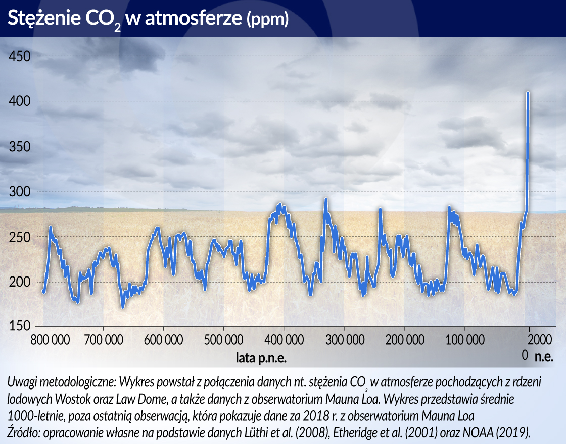
komentarz tutaj
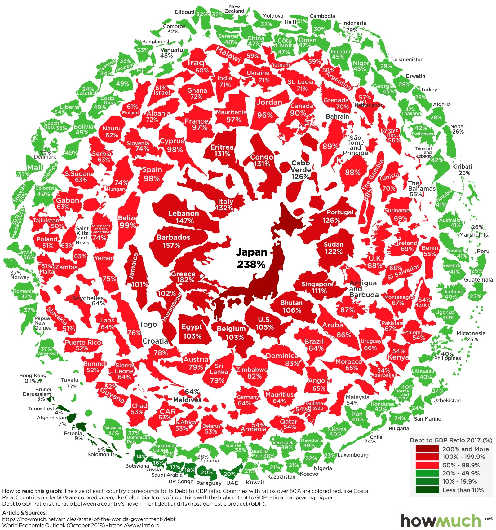
Visualizing the Snowball of Government Debt
The World’s Largest 10 Economies in 2030
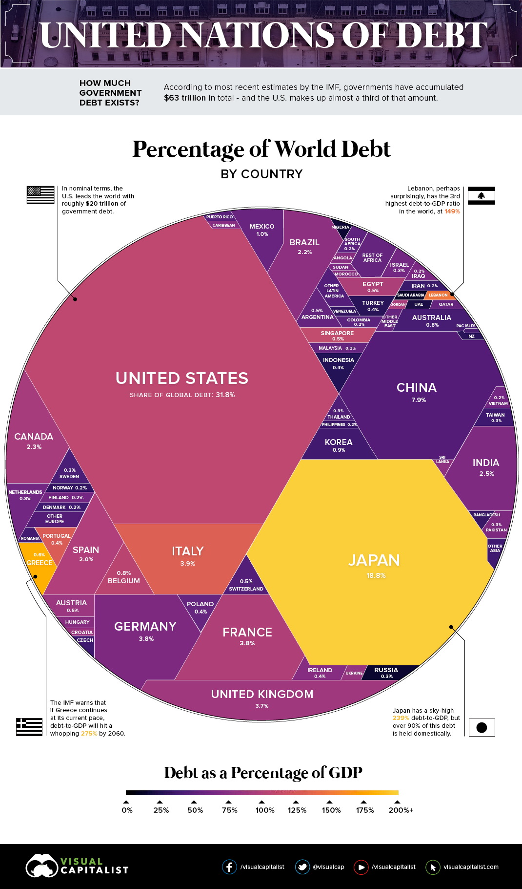
$63 Trillion of World Debt in One Visualization
$69 Trillion of World Debt in One Infographic

24 Cognitive Biases That Are Warping Your Perception of Reality
The 6 Forces Transforming the Future of Healthcare
The $80 Trillion World Economy in One Chart
The Multi-Billion Dollar Industry That Makes Its Living From Your Data
The Multi-Billion Dollar Industry That Makes Its Living From Your Data
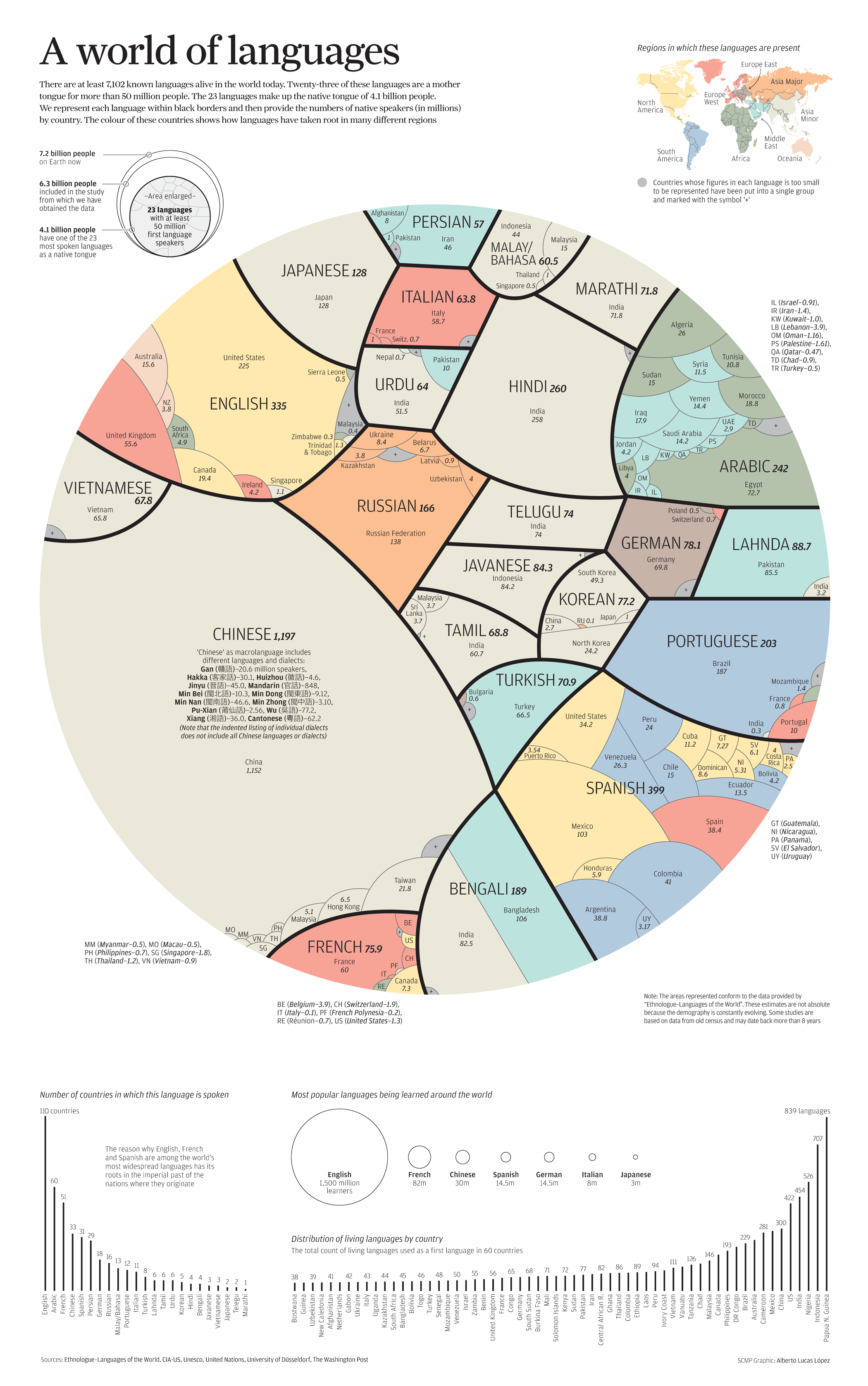
Infographic: A World of Languages
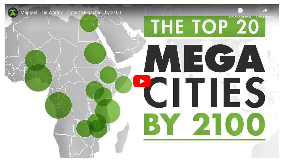
Animation: World’s Largest Megacities by 2100
Visualizing Elon Musk’s Vision for the Future of Tesla
see also: Animation: The Entire History of Tesla in 5 Minutes
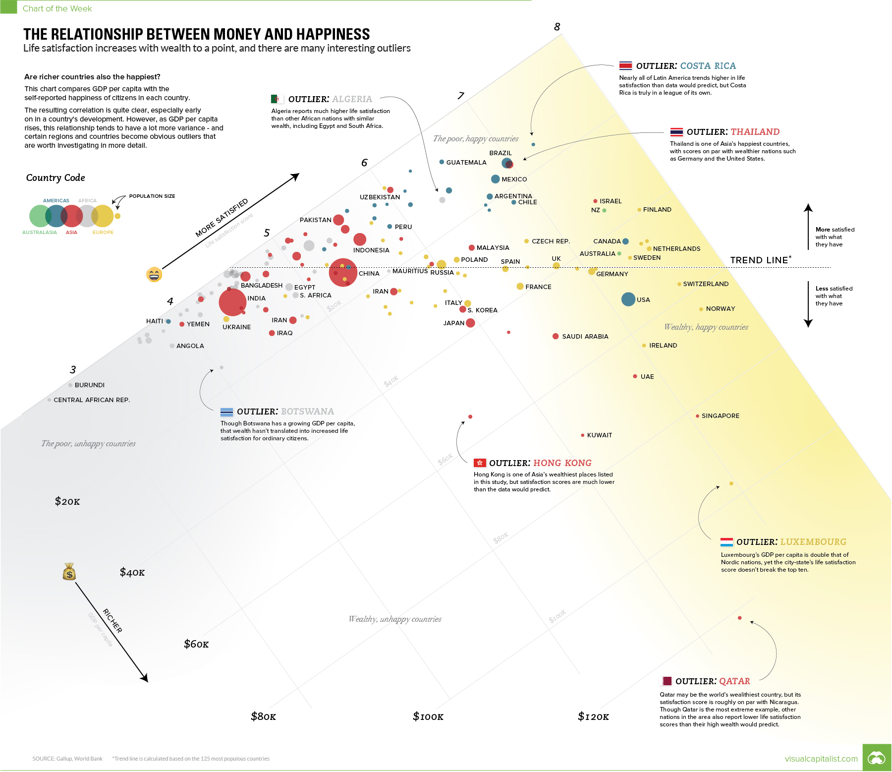
The Relationship Between Money and Happiness
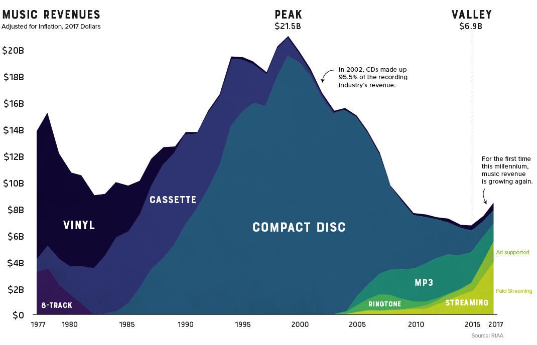
Visualizing 40 Years of Music Industry Sales
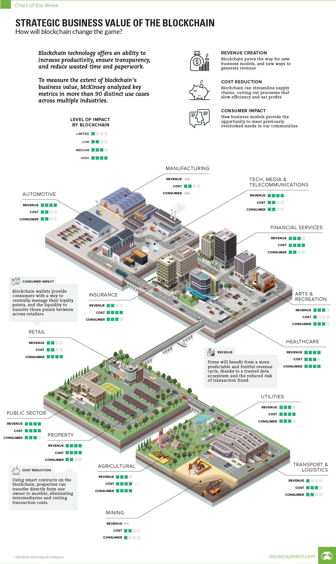
The Business Value of the Blockchain
Global Happiness: Which Countries are the Most (and Least) Happy?
Mapped: Global Happiness Levels in 2021
Visualizing the Extreme Concentration of Global Wealth
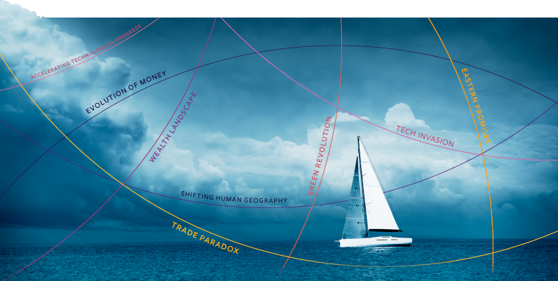
The 8 Major Forces Shaping the Future of the Global Economy
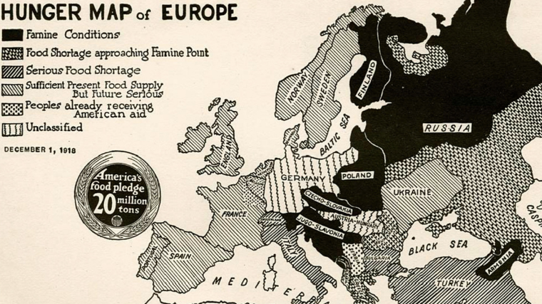
Mapa z 1918 roku; US FDA – braki żywnościowe w Europie po I Wojnie Światowej.
Animation: The World’s 10 Largest Economies by GDP
Histomap: Visualizing the 4,000 Year History of Global Power
Warto obejrzeć Histomap w wysokiej rozdzielczości.
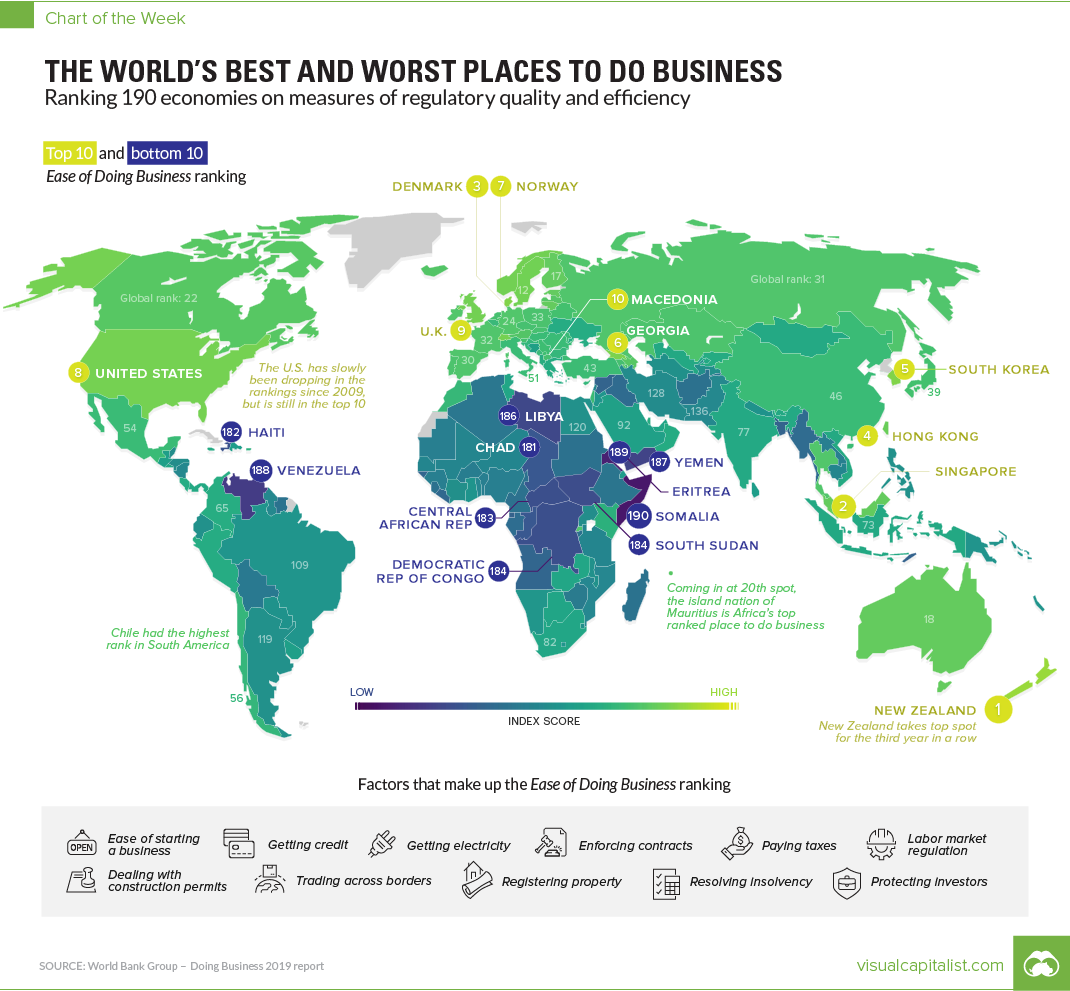
The World’s Best and Worst Places for Ease of Doing Business



Pierwsze dwie mapy obrazują siłę nabywczą zarobków w różnych regionach europejskich w latach 2018 i 2017.
Trzecia mapa pokazuje zróżnicowanie terytorialne Europy w poczatkach XV wieku. Widać wyraźną zależność pomiędzy obecnym bogactwem niektórych regionów (w obrębie tzw. Niebieskiego, Europejskiego banana – https://pl.wikipedia.org/wiki/Europejski_banan) a rozdrobnieniem terytorialnym Europy w przeszłości (co związane jest m.in. z większa konkurencyjnością w obrębie Europejskiego banana).
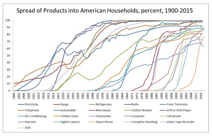
Rozprzestrzenianie się różnych produktów wśród gospodarstw domowych w USA
(na podstawie: Onward and Upward: Bet on Capitalism—It Works)
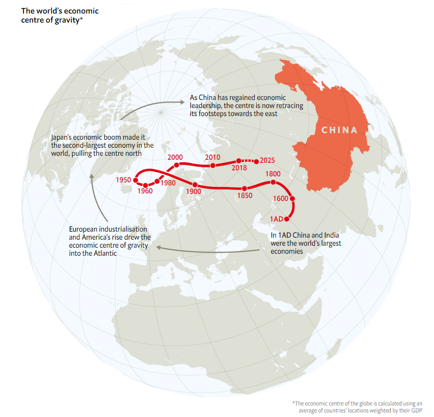
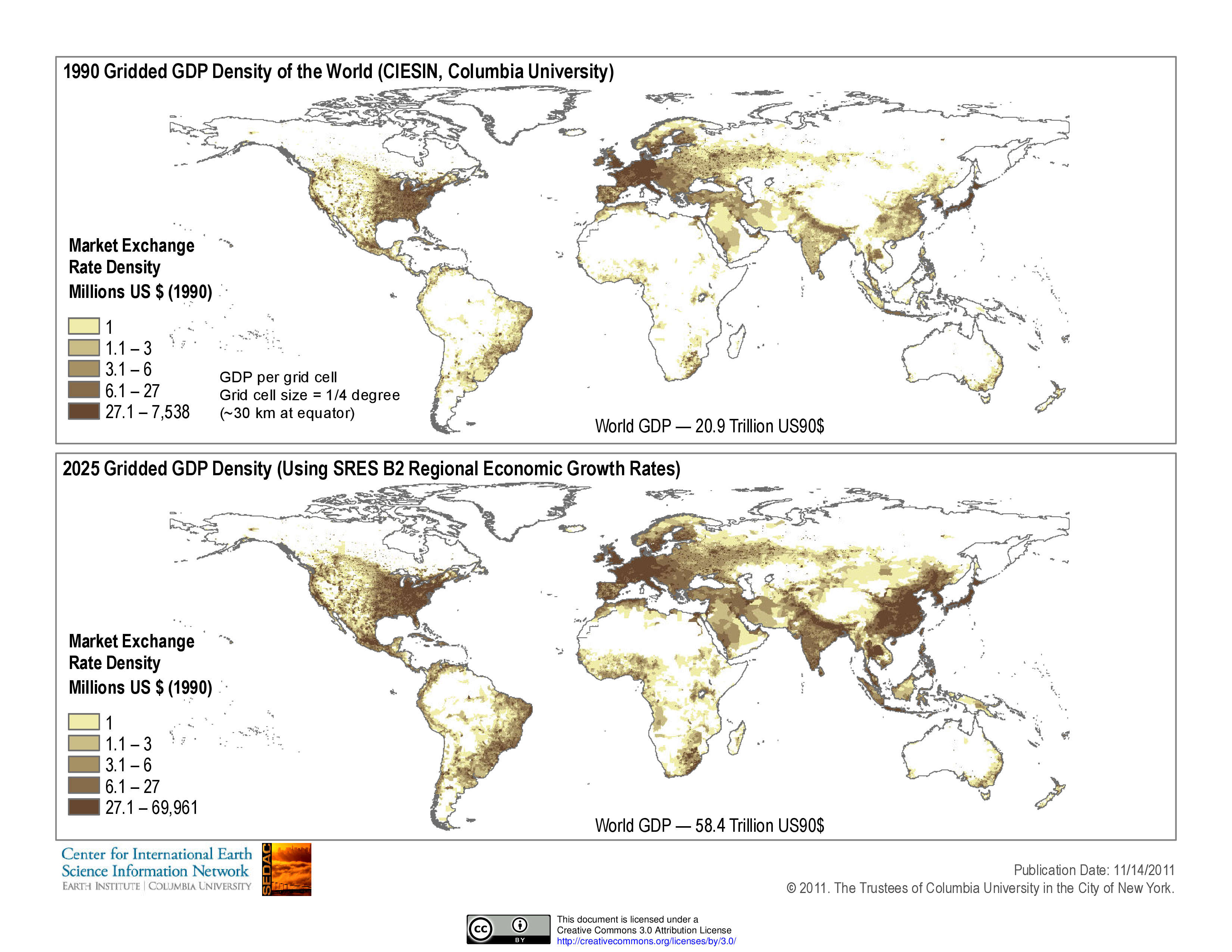
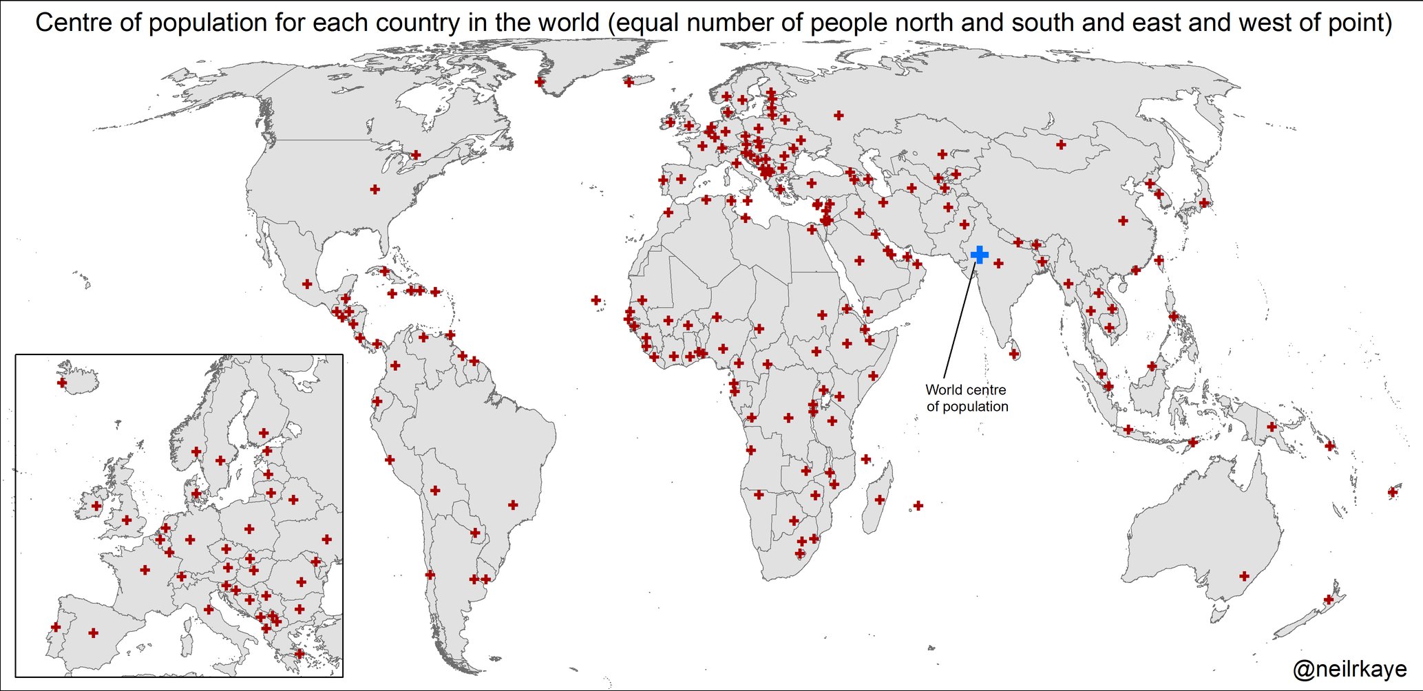
Centrum aktywności gospodarczej …
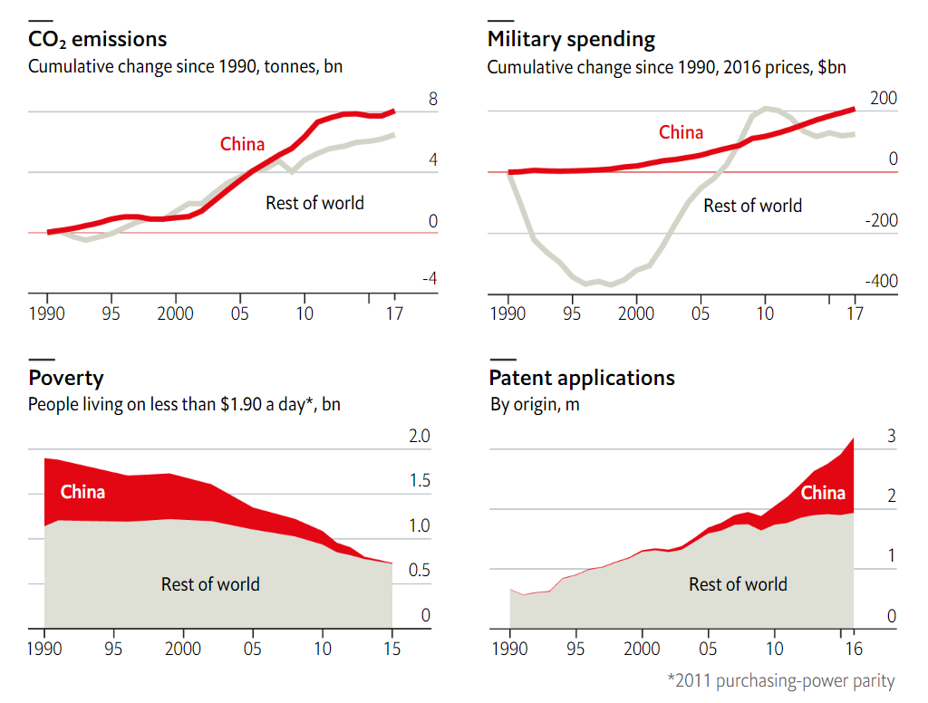 Chiny, ach te Chiny.
na podstawie: The Chinese century is well under way

Miesięczny przydział na kartki w późnym PRLu (o reglamentacji w PRLu na początek tutaj lub tutaj)
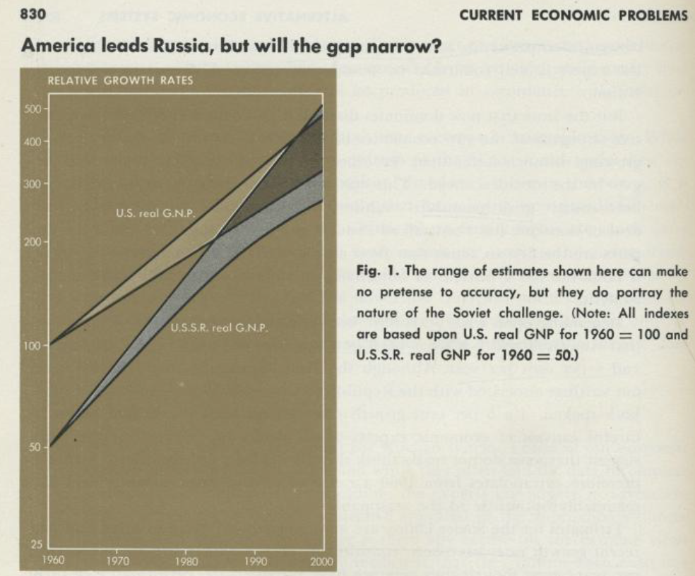
Z podęcznika P. Samuelsona ‘Economics’ wydanego w 1961 r.
Patrz też: Paul Samuelson’s repeated predictions of the Soviet Union economy catching up with the USA

Paul Samuelson, Laureat Nagrody im. Alfreda Nobla z Ekonomii w 1970 r., i laureat tejże nagrody William D. Nordhaus w 2018 r., iście profetycznie twierdzili w wydanym w 1989 roku podręczniku ‘ Economics’ (kopia powyżej):
“… the Soviet economy is proof that, contrary to what many skeptics had earlier believed, a socialist command economy can function and even thrive.”
Czy tak będziemy robić zakupy w przyszłości? – ciekawa infografika
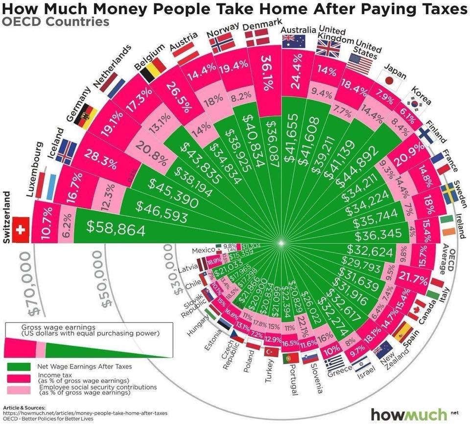
Ile nam zostaje w kieszeni po opodatkowaniu – kraje OECD

Znalazłem to w sieci, wygląda na slajd z wykładów.
(z wyjaśnienia pod tym rysunkiem wnioskuję, wykładowca nie jest ekonomistą, a byłym policjantem, a wykład był na studiach podyplomowych, których tematyka była daleka od ekonomii, ale na uczelni ekonomicznej)

Bardzo niepoprawna
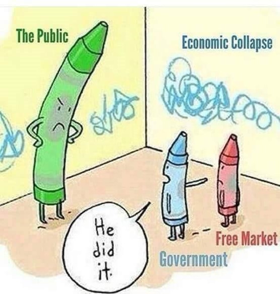

Nie wierzcie bezkrytycznie we wszystko co mówię na wykładach!
To statyczny rysunek, żaden tam gif, czy wideo.
Podobnie jest z ‘dobrym ekonomistą’ i ‘złym ekonomistą’,
(więcej o dobrych i złych ekonomistach: patrz Frédéric Bastiat i Henry Hazlitt).

USAFacts
Najlepsze z Visual Capitalist
- Our Top Infographics of 2019
- The Year in Review: 2020 in 20 Visualizations
- Visual Capitalist’s Top 20 Visualizations of 2020
- “The Rise and Fall of Civilizations”(Counting down the 12 best posts on world history)
- “The Juggling Act” How changing demographics are shaping our economic future
- “Commodities: Explained Through Powerful Visuals” Here are 9 techniques we use to make them easier to understand
- “A New Way to Look at Maps” These 9 Unconventional Maps Will Make You Think
- “The Psychology of Investing” How to Stay Rational in Turbulent Times
- Wealth: Who Has It, and How to Build Your Own; These 9 visuals shine a spotlight on the world’s richest
- “The Evolution of World Debt” A behind the scenes look at the Visual Capitalist process
- Timeline: 150 Years of U.S. National Debt
- The State of Household Debt in America
- What is a Commodity Super Cycle?
- The Safest Source of Energy Will Surprise You
- 11 Stunning Visualizations of Gold Show Its Value and Rarity
- Why Gold is Money: A Periodic Perspective
- Map: The Countries With the Most Oil Reserves
- The Raw Materials That Fuel the Green Revolution
- Visualizing U.S. Energy Use in One Giant Chart
- The Oil Market is Bigger Than All Metal Markets Combined
- Visualizing the Biggest Risks to the Global Economy in 2020
- As the Worlds Turn: Visualizing the Rotation of Planets
- 7 Striking Maps that Visualize the Human Footprint
- Visualized: The Race to Invest in the Space Economy
- The Problem of an Aging Global Population, Shown by Country
- The Pension Time Bomb: $400 Trillion by 2050
- Mapping the Global Flow of Foreign Aid
- Visualizing 200 Years of Systems of Government
- How China Overtook the U.S. as the World’s Major Trading Partner
- Visualizing China’s Most Ambitious Megaproject
- Fascinating Map of Medieval Trade Routes
- Internet Browser Market Share (1996–2019)
- Tesla’s Valuation Surpasses Ford and GM Combined
- Tesla Bears: A Short Short Story
- Ranked: The Most Valuable Brands in the World
- 50 Cognitive Biases in the Modern World
- Top Countries by GDP and Economic Components (1970-2017)
- Visualizing the 700-Year Fall of Interest Rates
- The History of Interest Rates Over 670 Years
- The Pyramid of Equity Returns: Almost 200 Years of U.S. Stock Performance
- The Dominance of U.S. Companies in Global Markets
- How the Internet of Things is Building Smarter Cities
- Ranking the World’s Most Populous Cities, Over 500 Years of History
- The Fastest Growing Cities in the World (2000-2016)
- Form and Function: Visualizing the Shape of Cities and Economies
- Visualizing the Footprint of Highways in American Cities
- Ranked: The 10 Most Expensive Cities in the World
- The Anatomy of a Smart City
- Animation: World’s Largest Megacities by 2100
- The Megacity Economy: How Seven Types of Global Cities Stack Up
- Mapping the World’s New Megacities in 2030
- 30 Cities Best Positioned for Long-Term Success
- Meet China’s 113 Cities With More Than One Million People
- The World’s Top 10 Cities in 2035
- The Impact of International Students on the U.S. Economy
- Where Are the Oldest Companies in Existence?
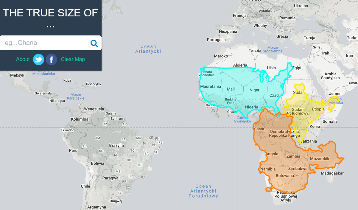
- Visualizing the True Size of Africa
- Some Common Geographic Mental Misplacements…
- How Technology is Shaping the Future of Education
- The Most Innovative Economies in the World
- Female Breadwinners Have Doubled, But Barriers Remain
- The Psychological Pitfalls of a Market Cycle
- The Fed’s Balance Sheet: The Other Exponential Curve
- Mapping the Greatest Empires of History
- Animation: How the European Map Has Changed Over 2,400 Years
- Currency and the Collapse of the Roman Empire
- Animation: Human Population Growth Over All of History
- Population Boom: Charting How We Got to Nearly 8 Billion People
- The World Population in 2100, by Country
- Visualizing 200 Years of U.S. Population Density
- Histomap: Visualizing the 4,000 Year History of Global Power
- These Charts Put the Historic U.S. Job Losses in Perspective
- How Oil Prices Went Subzero: Explaining the COVID-19 Oil Crash
- MISCA Map of Every Object in Our Solar System
- The State of Press Freedom Around the World
- The Richest People in the World
- The State of Press Freedom Around the World
- Incredible Map of Pangea With Modern-Day Borders
- The Anatomy of Land Use in America
- Wired World: 35 Years of Submarine Cables in One Map
- 11 Cognitive Biases That Influence Political Outcomes
- Hunger Pandemic: The COVID-19 Effect on Global Food Insecurity (Poverty)
- Mapped: The Geology of the Moon in Astronomical Detail
- The World’s Rapid Rise in Life Expectancy, in Just 13 Seconds
- Gold in Nevada: The Real Golden State
- The Impact of COVID-19 Shutdowns on the Gold Supply Chain
- Golden Bulls: Visualizing the Price of Gold from 1915-2020
- The World’s Gold and Silver Coin Production vs. Money Creation
- How 10 Billionaires Surmounted Failure to Build Massive Empires
- How U.S. Consumers are Spending Differently During COVID-19
- Visualizing the Countries Most Reliant on Tourism
- The State of Facial Recognition Around the World
- The 150 Apps that Power the Gig Economy
- All of the World’s Money and Markets in One Visualization
- Charting the Rise and Fall of the Global Luxury Goods Market
- How People and Companies Feel About Working Remotely
- 5G Revolution: Unlocking the Digital Age
- Visualizing the Evolution of Consumer Behavior
- The Most Loved Brands, by Generation
- Discount Domination: Dollar Stores are Thriving in America
- Charting the Rise and Fall of the Global Luxury Goods Market
- The Amazonification of Healthcare
- The Consumer Potential of Retail Cannabis
- An Investing Megatrend: How Emerging Wealth is Shaping the Future
- How COVID-19 Consumer Spending is Impacting Industries
- How the Modern Consumer is Different
- Are American Consumers Taking On Too Much Debt?
- The Racial Wealth Gap in America: Asset Types Held by Race
- Charting the Last 20 Years of Supertall Skyscrapers
- Cryptocurrency: Redefining the Future of Finance
- Vegetarianism: Tapping Into the Meatless Revolution
- How Big Tech Makes Their Billions
- The Future of Remote Work, According to Startups
- Each Region’s Median Age Since 1950
- 10 Types of Innovation: The Art of Discovering a Breakthrough Product
- The 50 Most Innovative Companies
- The Most Loved Brands, by Generation
- What Does 1GB of Mobile Data Cost in Every Country?
- Paradigm Shift: The Rise of Women’s Earning Power
- Animation: The World’s Rapid Rise in Life Expectancy, in Just 13 Seconds
- 5 Ways Technology is Transforming the Healthcare Industry
- The State of Women’s Economic Rights Worldwide
- Brief History of Jewelry Through the Ages
- Animated Map: The History of U.S. Counties
- The Best and Worst Pension Plans, by Country
- Measuring the Level of Competition for Valuable Minerals
- Visualizing the Rise of Digital Payment Adoption
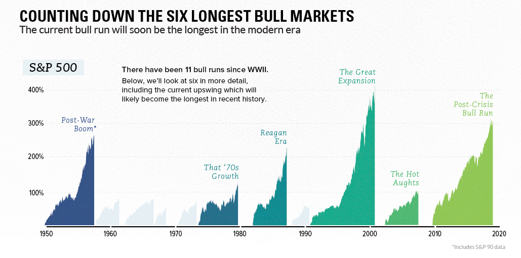
- How the S&P 500 Performed During Major Market Crashes
- What’s Powering the World?
- AIoT: When Artificial Intelligence Meets the Internet of Things
- Understanding the Disconnect Between Consumers and the Stock Market
- Where Will the Next Billion Internet Users Come From?
- The 20 Most and Least Profitable Companies, Per Employee
- The World’s Nuclear Reactor Landscape
- R&D SPENDING BY COUNTRY
- Population density
- 12 Ways to Get Smarter in One Infographic
- Which Universities Have the Richest Graduates?
- Visualizing the Human Impact on the Ocean Economy
- Ocean Economy: The Next Wave of Sustainable Innovation
- 50 Cognitive Biases in the Modern World
- The Geology of the Moon in Astronomical Detail
- 3D Mapping The Largest Population Density Centers
- Which College Degrees Get the Highest Salaries?
- The 6,000-Year History of Medical Cannabis
- Mind-Bending Medicine: An Overview of Psychedelic Substances
- Tesla is Now the World’s Most Valuable Automaker
- Tesla electrifies the auto industry’s new era
- Electric Vehicle Prices Fall as Battery Technology Improves
- The Stocks to Rule Them All: Big Tech’s Might in Five Charts
- 5G Revolution: Unlocking the Digital Age
- Finding the New Age, for Your Age
- Submarine Cable Map
- The World’s Network of Submarine Cables
- When Artificial Intelligence Meets the Internet of Things
- New Waves: The ESG Megatrend Meets Green Bonds
- The Most Popular Websites Since 1993
- Visualizing the Social Media Universe in 2020
- The 100 Most Popular City Destinations
- The Decline of Upward Mobility in One Chart
- Silver Bulls: Visualizing the Price of Silver
- Silver Through the Ages: The Uses of Silver Over Time
- How to Avoid Common Mistakes With Mining Stocks (Part 1: Team, Part 2: Business Plan, Part 3: Jurisdiction, Part 4: Project Quality)
- Here are 15 Common Data Fallacies to Avoid
- The 6 Biggest Mistakes Ordinary Investors Make
- 11 Cognitive Biases That Influence Political Outcomes
- The World Macroeconomic Risk Map in 2020
- Visualizing the State of Democracy, by Country
- Life and Times During the Great Depression
- Ethical Supply: The Search for Cobalt Beyond the Congo
- How Shenzhen became China’s Silicon Valley
- What Happens Every Minute on the Internet in 2020
- The $88 Trillion World Economy in One Chart
- Visualizing the $94 Trillion World Economy in One Chart
- Global investment
- Wildfires and Climate Change
- The China Footprint
- Redefining Old Age
- Charting the Flows of Energy Consumption by Source and Country (1969-2018)
- The Comparative Might of Continents
- Incredible Map of Pangea With Modern-Day Borders
- Median Age of the Population in Every Country
- Visualizing American Income Levels by Age Group
- How Millennials are Fueling the Rental Economy
- The Most Loved Brands, by Generation
- Visualizing Social Media Use by Generation
- Why Gen Z is Approaching Money Differently Than Other Generations
- Forecasting the Investing Habits of the Millennial Generation
- This Chart Shows How Different Generations Would Invest $10,000
- 29 Psychological Tricks To Make You Buy More
- New Climate Maps Show a Transformed United States
- Vegetarianism: Tapping Into the Meatless Revolution
- The Carbon Footprint of the Food Supply Chain
- Visualizing Global Per Capita CO2 Emissions
- Mainstream EV Adoption: 5 Speedbumps to Overcome
- Animated Map: The Comparative Might of Continents
- Visualizing the 200-Year History of U.S. Interest Rates
- A Snapshot of the Global Personal Tech Market
- Every Company In and Out of the Dow Jones Industrial Average Since 1928
- Visualizing U.S. Money Supply vs. Precious Metal Production in the COVID-19 Era
- All the World’s Metals and Minerals in One Visualization
- 12 Brand Archetypes That Marketers Use to Get Your Attention
- The Most Valuable Nation Brands
- The 10 Organizations With the Best (and Worst) Reputations
- How the Modern Consumer is Different
- Is Brand Loyalty Dead?
- The Most Loved Brands, by Generation
- The Most Valuable Brands in the World
- The Top 50 Most Valuable Global Brands
- The Jeff Bezos Empire in One Giant Chart
- The Fastest Growing and Declining Retail Brands, from 2019-2020
- The COVID-19 Impact on Advertising Spend
- Animation: Global Population by Region From 1950 to 2100
- A Breakdown of Amazon’s Revenue Model
- Amazon’s Most Notable Acquisitions to Date
- The World’s 100 Smallest Countries
- 7 Striking Maps that Visualize the Human Footprint
- The Economics of Coffee in One Chart; From Bean to Brew: The Coffee Supply Chain
- Coffee vs Tea vs Soft Drinks: What Caffeine Drinks Do Countries Prefer?
- Cocoa: A Bittersweet Supply Chain
- What did Earth look like years ago?
- Wired World – internet
- Visualizing the Evolution of Global Advertising Spend (1980-2020)
- Tech’s Bizarre Beginnings & Lucrative Pivots (Samsung, Apple, Facebook, Sony, …)
- The 100 Most Spoken Languages Around the World
- The Most Popular Websites Since 1993
- The global music industry has been hit by the COVID-19 pandemic
- These 6 Powerful Signals Reveal the Future Direction of Financial Markets
- The Shape of the World, According to Old Maps
- Visualizing the Biggest Threats to Earth’s Biodiversity
- A Look at Earth’s Biodiversity Loss, By Region
- Bitcoin is Near All-Time Highs and the Mainstream Doesn’t Care…Yet
- Cryptocurrency: Redefining the Future of Finance
- How Big is the Global Mobile Gaming Industry?
- Debt-to-GDP Continues to Rise Around the World
- Fueled by Innovation: How Technology is Boosting Efficiency in Oil & Gas
- The Big Five: Largest Acquisitions by Tech Company (GAFA+)
- A Global Look at How People Spend Their Time
- Which College Degrees Get the Highest Salaries?
- The 30-Year History of the World Wide Web (Internet) (wpis na FB)
- A Data-Driven Look at the Internet
- This Paper Map Shows the Extent of the Entire Internet in 1973
- Internet Browser Market Share (1996–2019)
- The 20 Internet Giants That Rule the Web
- Which Countries Have the Most Internet Users?
- Where Will the Next Billion Internet Users Come From?
- Visualizing Internet Suppression Around the World
- Visualizing the Social Media Universe in 2020
- Here’s What Happens Every Minute on the Internet in 2020
- The 50 Most Visited Websites in the World
- 5 Big Picture Trends Being Accelerated by the Pandemic
- 5 Undeniable Long-Term Trends Shaping Society’s Future
- Ranked: The Most Valuable Nation Brands in 2020
- Snapchat: The Most Popular Social Media Among U.S. Teens
- Mapped: The World’s Biggest Oil Discoveries Since 1868
- Santa’s New Home: The North Pole is Moving to Russia
- Breaking the Ice: Mapping a Changing Arctic
- Facebook’s Path to Social Network Domination (2008-2020)
- The Rise and Fall of Social Media Platforms
- The Top Surveillance Cities Worldwide
- 30 Cities Best Positioned for Long-Term Success
- Cost of lighting
- The Business of Airbnb, by the Numbers
- Why Gold Mining Stocks Outperform Gold in Bull Markets
- The Habits of Highly Successful Entrepreneurs
- Top 10 Habits of Millionaires for Building Wealth
- Visualizing the Daily Routines of Famous Creative People
- The Habits of Highly Effective Leaders
- How Nine Covid-19 Vaccines Work
- The 50 Richest Women in the World in 2021
- The Best and Worst Pension Plans, by Country
- Historical Trends in Global Monthly Surface Temperatures (1851-2020)
- This Interactive Chart Shows Changes in the World’s Top 10 Emitters
- The Crazy World of Stonks Explained (GameStop, …)
- How Global Health and Wealth Has Changed Over Two Centuries
- Visualizing How Much Countries Spend on R&D
- The COVID-19 Pandemic – One Year In
- Key Events in the COVID-19 Timeline
- Visualizing the History of Pandemics
- the World’s Deadliest Pandemics by Population Impact
- The Countries with the Most Linguistic Diversity
- Who Americans Spend Their Time With, by Age
- Designing the future. China’s five-years plans
- The U.S. Share of the Global Economy Over Time
- The Gen Z Unemployment Rate, Compared to Older Generations
- Visualizing the Rise of Women on Boards of Directors Worldwide
- Rare Earth Metals Production is No Longer Monopolized by China
- All the World’s Metals and Minerals in One Visualization
- Shrinking Portions: Visualizing Rising Food Prices
- Income in Each State, Adjusted for Cost of Living
- Visualizing U.S. Stock Ownership Over Time (1965-2019)
- Which Asian Economies Have the Most Sustainable Trade Policies?
- The Fed’s Balance Sheet: The Other Exponential Curve
- Comparing the Titanic to a Modern Cruise Ship
- The 25 Richest Countries in the World
- The 25 Poorest Countries in the World
- Purchasing Power of the U.S. Dollar Over Time
- The U.S. Share of the Global Economy Over Time
- How the smartphone market has changed
- The U.S. Cities With The Most Homeless People
- The State Of World Press Freedom
- The Rising Wave of Natural Disasters
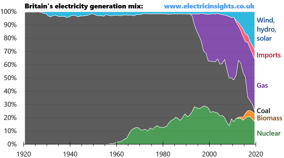
- Żródła elektryczności: kopalne, nuklearane, odnawialne
- Key Events in U.S. History that Defined Generations
- A Golden Future: Visualizing the Economic Case for Gold
- The World’s Top Countries for Military Spending
- The World’s Biggest Passenger Ships from 1831-Present
- Five Trends for Investors to Watch Amid a COVID-19 Recovery
- Explore this Fascinating Map of Medieval Europe
- The Exponential View of Solar Energy
- Sand, Steel, and Cement: The Annual Production of the World’s Building Blocks
- Electricity from Renewable Energy Sources is Now Cheaper than Ever
- Timeline: Key Events in the History of Online Shopping
- Dividing the pie
- 1 Billion Years of Tectonic Plate Movement in 40 Seconds
- Visualized: The Biggest Ponzi Schemes in Modern History
- Tax-to-GDP Ratio: Comparing Tax Systems Around the World
- 1.6 Billion Disposable Masks Entered Our Oceans in 2020
- U.S. Military Spending vs Other Top Countries
- How Dominant is the U.S. Dollar?
- Visualizing the Gravitational Pull of the Planets
- Ranked: The Best and Worst Pension Plans, by Country
- Visualizing the Evolution of Global Advertising Spend (1980-2020)
- Ranked: The Most Innovative Companies in 2021
- The Population Race: A 300-Year Look at China vs. India
- Map Explainer: Key Facts About Afghanistan
- 30 Years of U.S. Money Supply and Interest Rates
- Visualizing the Power of Gold Versus Currencies
- All the Biomass of Earth, in One Graphic
- Visualizing the Accumulation of Human-Made Mass on Earth
- Which Companies Belong to the Elite Trillion-Dollar Club?
- Climate Impact Map
- Daily Routine, 2020
- Razor Thin: A New Perspective on Earth’s Atmosphere
- The Power of a Uranium Pellet
- What Does it Cost to Run Big Business?
- The Most Innovative Companies in 2021
- Every Single Cognitive Bias in One Infographic
- Cognitive Biases: Three Common Types Illustrated
- How Genetically Similar Are We To Other Life Forms?
- The Evolution of Computer Science in One Infographic
- 9/11 Timeline: Three Hours That Changed Everything
- Rare Earth Metals Production is No Longer Monopolized by China
- Visualizing 50 Years of Global Steel Production
- Visualizing China’s Evolving Energy Mix
- Electricity from Renewables vs. Coal in G20 Nations
- Visualizing Gold Investment Compared to Global Assets
- Basic Income Experiments Around the World
- The 20 Fastest Growing Jobs in the Next Decade
- The History of the Abitibi Gold Belt
- The Economic Impact of 9/11, in 10 Charts
- The 20 Fastest Growing Jobs in the Next Decade
- This Simple Chart Reveals the Distribution Of Global Wealth
- The Top 10 Richest People on the Planet
- Tax-to-GDP Ratio: Comparing Tax Systems Around the World
- This is How Much NATO Countries Spend on Defense
- Visualizing the Rise of Cryptocurrency Transactions
- Visualizing the Products and Fuels Made from Crude Oil
- Which Countries Have the World’s Largest Coal Reserves?
- Visualizing the World’s Biggest Pharmaceutical Companies
- COVID-19 geographical animation
- Each Region’s Median Age Since 1950
- Mapping the World’s Youngest and Oldest Countries
- Is Age Just a Number? Big Wins by Older Entrepreneurs
- How Americans Make and Spend Their Money, by Age Group
- The Best and Worst Pension Plans, by Country
- The Pension Time Bomb: $400 Trillion by 2050
- A Visual Introduction to the Dwarf Planets in our Solar System
- Tracking Global Hunger and Food Insecurity
- Distribution of Global GDP by Region
- Charting the Continued Rise of Remote Jobs
- How the European Map Has Changed Over 2,400 Years
- Global food-supply. Where does all the worlds food go
- Electric Car Companies: Visualizing the Race for EV Dominance
- Countries by Alcohol Consumption Per Capita
- The Top 25 Most Popular Social Media Platforms in the World
- The Geography of Global Literacy
- The World’s Most Influential Values, In One Graphic
- Which Countries Have the Most Similar Values?
- How Has Car Safety Improved Over 60 Years?
- How Reserve Currencies Have Evolved Over 120 Years
- Graphene: The Wonder Material of the Future
- The World’s First $3 Trillion Company? (Apple)
- Why it’s so hard to electrify shipping and aviation
- Our Top 21 Visualizations of 2021
- 30 Years of Deforestation and Forest Growth, by Country
- Visualizing the Scale and Composition of the Earth’s Crust
- The Companies that Defined 2021
- Food Production Around the World
- 2021: The year in charts
- From Greek to Latin: Visualizing the Evolution of the Alphabet
- The 100 Most Spoken Languages Around the World
- Visualizing Human Evolution with a New Ancient Human Species
- Which Values Children Should Be Encouraged to Learn, By Country
- Industry 4.0: What Manufacturing Looks Like in the Digital Era
- Timeline of mathematics
- Visualizing Nuclear Power Production by Country
- Visualizing the Power of the World’s Supercomputers
- Visualizing China’s Dominance in Clean Energy Metals
- How People Around the World Feel About Their Economic Prospects
- The 20 Internet Giants That Rule the Web
- Corruption in Countries Around the World
- The Cost of Space Flight Before and After SpaceX
- The Inflation Rate in the U.S.: Past, Present, and Future
- Visualizing Countries Grouped by Their Largest Trading Partner (1960-2020)
- The long road to electric cars
- Water Scarcity Clock
- How Interest Rate Hikes Affect Gold’s Price
- Visualizing Gold Investment Compared to Global Assets
- The World’s Growing Middle Class (2020–2030)
- American Companies That Failed in China
- Purchasing Power of the U.S. Dollar Over Time
- The Biggest U.S. Tax Breaks
- Here’s How Reserve Currencies Have Evolved Over 120 Years
- American Companies That Failed in China
- Visualizing the World’s Loss of Forests Since the Ice-Age
- Visualizing Design: 196 Flags of Countries Around the World
- Visualizing the History of Energy Transitions
- How Automaker Logos Have Evolved Over the Past Century
- Visualizing the Material Impact of Global Urbanization
- Purchasing Power of the U.S. Dollar Over Time
- The World’s Biggest Private Tax Havens
- The Accelerating Frequency of Extreme Weather
- How People Around the World Feel About Their Economic Prospects
- The History & Evolution of Shaving
- Mapped: The Greenest Countries in the World
- ENERGY How Far Are We From Phasing Out Coal?
- Visualizing Companies with the Most Patents Granted in 2021
- How the Mobile Phone Market Has Evolved Over 30 Years
- U.S. Consumer Debt Approaches $16 Trillion
- The History of U.S. Energy Independence
- The Road to Decarbonization: How Asphalt is Affecting the Planet
- Visualizing the Coming Shift in Global Economic Power (2006-2036p)

